Every page ranking for form conversion rate benchmarks tells you to cut fields, and every one of them cites a number for it. Three fields convert at 25%. Or 23.1%. Seven fields drop to 12%, or to 11.4%, depending on which page you opened. The tables disagree, but they all trace their authority to the same place: an analysis of 40,000 landing pages published by HubSpot.
That analysis published no such numbers. It contains four graphs and a set of directional statements, and its author never printed a conversion-rate-by-field-count table at all. The percentages in circulation were read off those graphs by other people, then re-quoted as measurements. That is why two 2026 benchmark pages can claim identical lineage and still disagree by two points at every row.
The reason nobody caught it is the second problem. Form benchmarks do not share a denominator, so you cannot cross-check one against another. A 17.3% median, a 5.13% average and a 45% completion rate are all in circulation as “form conversion rate,” and they divide by three different populations. This page puts every published figure in one table with its denominator, sample and source attached, then says which one applies to your form.
Direct answer — What is a good form conversion rate?
Form conversion rate is the share of a defined form population that submits, so the figure means nothing until the population is named. Measured from form starts, published benchmarks run 42% to 67% by sector. Measured from form views, roughly 41%. Measured from website sessions, 5.13%. Measured across landing pages, a 6.6% median. These are not competing estimates of one number. They are four different metrics sharing one label.
Key Takeaways
- The field-count table every 2026 benchmark page reprints traces to Dan Zarrella’s HubSpot analysis, which published graphs and directional findings, not percentages. The precise figures were inferred from those graphs downstream.
- Four denominators circulate under one label: form starts, form views, website sessions, and landing page visitors. Comparing across them is a category error, not a rounding disagreement.
- Zuko’s dataset is the largest with published methodology at 93 million form views. It has no B2B, SaaS or professional services category, and 58% of it is financial services, forex and gambling.
- Ruler Analytics’ 5.13% counts phone calls alongside form submissions and divides by sessions. It appears on ranking pages inside tables headed “form conversion rate.”
- Software forms complete at 50.61% from form start in Zuko’s data, against a 42.7% floor for enquiry forms. Sector matters less than form purpose.
- There is no public, B2B-specific, field-count-controlled form dataset. Any “B2B forms convert at X%” claim is borrowed from a non-B2B population or is vendor-internal and unaudited.
- An added field costs you the ratio between the two conversion rates, not the difference. Dropping from 17.0% to 11.4% raises cost per lead by 49%.
What a form conversion rate actually measures
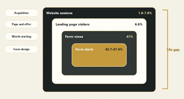
Form conversion rate is the percentage of a defined starting population that submits a form, which means the number carries no information until that population is named. The arithmetic never varies. The starting population varies constantly, and that is where every disagreement in this topic comes from.
Form conversion rate = Submissions ÷ Starting population × 100Four starting populations are in active use. Each produces a legitimate metric. None of them is interchangeable with the others, and a figure quoted without its denominator cannot be compared to anything.
| Denominator | What it counts | Typical published band | What it tells you | Who reports it |
|---|---|---|---|---|
| Form starts | People who interacted with at least one field | 42.7% – 67.4% | Whether the form itself is workable once engaged | Form analytics vendors |
| Form views | People who saw the form, engaged or not | ~41% | Whether the form is worth starting | Form analytics vendors |
| Landing page visitors | Everyone who reached the page | 6.6% median | Whether the page and offer work together | Landing page platforms |
| Website sessions | All tracked sessions, all pages | 1.9% – 7.9% | Whether acquisition spend reaches intent at all | Attribution platforms |
The gap between the top row and the bottom row is roughly tenfold, and none of it is performance. A team reporting 55% and a team reporting 5% can be running the same form on the same traffic in the same quarter. The form is the entry point to the wider sequence of stages a B2B deal passes through, and every stage below it repeats this same problem with its own set of contested denominators.
The form conversion benchmark ledger
A benchmark is quotable when its publisher states the sample, the population and the measurement window. Below is every figure currently circulating for this keyword, sorted by how much of its own methodology the publisher actually disclosed.
| Figure | Source and date | Sample | Denominator | Population | Quotable? |
|---|---|---|---|---|---|
| 42.7% – 67.4% by sector | Zuko Analytics, rolling | 739 forms, 60M form starts, 38M completions | Form starts | 58% financial services, forex and gambling; 74% mobile | Yes, with the composition stated |
| 70.22% cart abandonment | Baymard Institute, updated Sept 2025 | Meta-analysis of 50 studies | Cart additions | Ecommerce checkout only | Yes, for checkout |
| 6.6% median | Unbounce Conversion Benchmark Report | 464M visitors, 57M conversions, 41,000 pages | Landing page visitors | Landing pages only, July 2023 to July 2024 | Yes, as a landing page figure |
| 5.13% average | Ruler Analytics, May 2026 | 110M+ sessions, 5M+ conversions, 13 industries | Website sessions | Blends B2B and B2C; counts phone calls as conversions | Not as a form rate |
| 17.3% median | Digital Applied, April 2026 | Undisclosed | Stated as form interactions | Aggregated from seven named vendors | No, no per-figure attribution |
| 23.1% / 17.0% / 11.4% at 3 / 5 / 7 fields | Digital Applied, April 2026 | Undisclosed | Stated as form interactions | Aggregated, no measurement window | No, source table not reproducible |
| 25% / 20% / 12% at 3 / 5 / 7 fields | Foundry CRO, April 2026 | Undisclosed | Not stated | Credited to HubSpot, Quicksprout, WPForms | No, conflicts with the row above |
| 50% – 60% form to meeting | RevenueHero | 1M+ inbound form fills | Submitted forms | Post-submit only, date range undisclosed | Yes, but it is not a form rate |
Suggested citation: IVRIS Tech, “Form Conversion Rate Benchmarks,” 2026, https://ivristech.com/form-conversion-rate-benchmarks/
Two rows deserve attention. The RevenueHero figure measures the funnel entirely after submit, from a submitted form to a booked meeting, so it shares no population with anything above it. Reading it next to a 6.6% landing page median invites the conclusion that forms convert better than pages, which is arithmetic nonsense: those are consecutive stages, not competing measurements. The same care applies to the demo request funnel, where five publishers report five different denominators under one heading.
The Ruler row is the one that has done real damage. Ruler defines a conversion as “a qualified lead or sale” and counts inbound phone calls alongside form submissions, dividing by tracked sessions. Their own 2026 benchmark report states the methodology plainly. Despite that, the 5.13% appears on the page currently ranking second for this keyword inside a table headed “Form Conversion Rate Benchmarks by Industry,” where WPForms reproduces the industry rows without the phone-call caveat. In software, roughly one conversion in ten in that dataset is a phone call, not a form.
Form conversion rate by form type
Form purpose predicts completion better than industry does. Zuko Analytics publishes the only large-sample breakdown by form purpose with per-type sample sizes attached, measured consistently from form start to submission.
| Form type | Completion from form start | Sessions in sample |
|---|---|---|
| Registration | 60.7% | 26,582,277 |
| Purchase | 54.4% | 20,179,282 |
| Onboarding | 51.8% | 4,678,212 |
| Application | 51.6% | 27,575,784 |
| Contact | 47.4% | 321,937 |
| Comparison | 46.4% | 7,583,511 |
| Configuration | 44.1% | 1,304,907 |
| Enquiry | 42.7% | 4,797,087 |
The spread from registration to enquiry is 18 points, and the direction is counterintuitive. Forms that ask for more, like applications at 51.6%, outperform forms that ask for almost nothing, like enquiries at 42.7%. Commitment already made before the form loads beats brevity. Somebody applying for a product has decided; somebody sending an enquiry is still deciding, and a decision left open is a decision that can be abandoned.
Note the contact row’s sample. At 321,937 sessions it is roughly one eightieth the size of the application sample, so treat 47.4% as the weakest estimate in the table rather than a firm benchmark.
IMPORTANT
Zuko’s dataset has no B2B, SaaS or professional services category. Software exists as a sector at 50.61% completion, but on 557,487 sessions it is well under 1% of the total. There is no public, large-sample, B2B-specific form dataset. Anyone quoting one is extrapolating.
Form abandonment rate and what the 55% actually counts
Form abandonment rate is the share of a defined form population that does not submit, which makes it the complement of completion and heir to exactly the same denominator problem. Change the population and the abandonment rate moves by more than twenty points without a single user behaving differently.
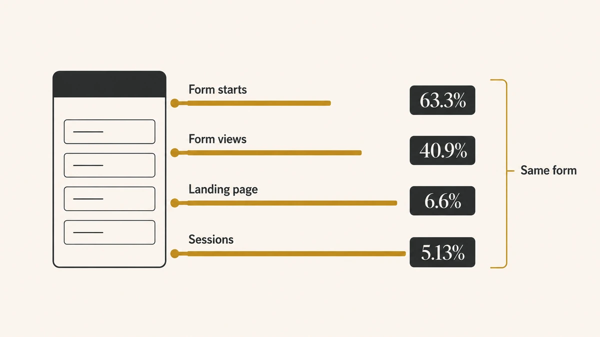
Zuko publishes the raw totals behind its benchmarks: 93 million form views, 60 million form starts and 38 million completions. Those three numbers let you derive both abandonment rates directly, and the derivation is worth doing because the published commentary rarely says which one it is quoting.
| Measured from | Completion | Abandonment | Derivation | What it diagnoses |
|---|---|---|---|---|
| Form views | 40.9% | 59.1% | 38M ÷ 93M | Whether the form is worth beginning |
| Form starts | 63.3% | 36.7% | 38M ÷ 60M | Whether the form is completable once begun |
| Cart additions | 29.8% | 70.22% | Baymard meta-analysis | Checkout friction, ecommerce only |
The widely quoted claim that “around 55% of people who view a form abandon it” is a view-based figure, and it sits close to but not on the 59.1% implied by Zuko’s current published totals, because it was taken from an earlier snapshot of a continuously updated dataset. Quote it with the snapshot date attached or not at all.
The 70.22% in the third row is the most-cited abandonment number in existence and the least applicable to a B2B lead form. Baymard Institute maintains it as a meta-analysis of 50 separate studies, last updated September 2025, and the individual studies range from 55% to 84.27%. Its denominator is cart additions, its population is ecommerce checkout, and its stability is remarkable: the figure has moved 0.65 points in five years. None of that makes it a form benchmark. A cart addition is a purchase intent signal with no equivalent in B2B lead capture.
The device split nobody adjusts for
Zuko’s dataset is 73.8% mobile and 24.8% desktop. Every completion figure drawn from it is therefore a predominantly mobile benchmark, and mobile forms complete measurably worse than desktop ones across every published comparison. B2B lead capture skews the other way, toward desktop, toward working hours, and toward users who arrived deliberately.
That mismatch runs in your favour when you benchmark a B2B form against these numbers, which is the opposite of the usual warning. If your desktop-heavy B2B form is merely matching a mobile-weighted benchmark, it is probably underperforming its true comparison set. Segment by device before drawing any conclusion, because the aggregate hides the only split that matters here.
The field-count rule traces to one study that published no numbers
The claim that three fields is the optimum is the most reproduced statement in this topic, and its evidence base is a single post by Dan Zarrella at HubSpot, “Which Types of Form Fields Lower Landing Page Conversions?”. It analysed over 40,000 customer landing pages, which is a real sample. What it reports is four graphs and four directional findings.
It does not print a conversion-rate-by-field-count table. It does not state a denominator. It does not state a measurement period. Its actual findings are qualitative: adding fields decreases conversion “slightly,” single-line text fields show “very little decrease,” free-text areas have a “powerful depressing effect,” and dropdown select boxes are associated with lower rates. The most useful finding in the original work, that field type matters more than field count, is the one the downstream tables dropped.
Trace the 2026 tables against it and the provenance chain breaks in the open:
| Publisher | 3 fields | 5 fields | 7 fields | Stated source |
|---|---|---|---|---|
| HubSpot (Zarrella), original | Graph only | Graph only | Graph only | 40,000+ landing pages, denominator unstated |
| Digital Applied, Apr 2026 | 23.1% | 17.0% | 11.4% | Seven vendors aggregated, no per-figure trace |
| Foundry CRO, Apr 2026 | 25% | 20% | 12% | HubSpot, Quicksprout, WPForms |
Two pages published the same month, both claiming the same origin, disagreeing at every row. Neither discloses a sample size or a measurement window. Digital Applied’s table is internally smooth to one decimal place across ten rows, which is the signature of a modelled curve rather than a measured distribution, and the page describes the resulting shape as a “5-to-7 cliff.”
The honest position: the direction is well supported and the magnitudes are not. More fields reduce completion. That is corroborated by Zuko’s field-level data and by the original analysis. The specific claim that three fields convert at 23.1% while seven convert at 11.4% has no reproducible source, and using those numbers to set a target is borrowing a precision nobody measured.
PRO TIP
Before citing any field-count figure, open the page it came from and look for a sample size and a date range. If the table has neither, it is a re-derivation. Cite the direction and measure the magnitude on your own form.
Field type predicts abandonment better than field count
The finding worth recovering from the original analysis is the one the benchmark tables discarded: not all fields cost the same. Zarrella separated fields by input type and found the curves diverged sharply. Single-line text fields, the kind that collect a name or an email address, showed very little decrease in conversion as they accumulated. Free-text areas had what he described as a powerful depressing effect. Dropdown select boxes were associated with lower rates throughout.
That reframes the design question usefully. A seven-field form of short text inputs is not equivalent to a four-field form containing a message box and two dropdowns, yet every published field-count table treats them as identical because it counts fields rather than weighing them. Counting is easy and wrong; weighing is harder and closer to how the form actually behaves.
The practical ordering, from cheapest to most expensive per field:
- Short single-line text for first name, email, company. Near-free once the user has committed to starting.
- Selects with few options, which cost more than text but stay tolerable when the list is short and the labels are obvious.
- Long dropdowns for country, industry, or job title, which force a scan-and-decide interaction rather than a typing one.
- Free-text areas, the single most expensive element you can put on a lead form, because they ask the user to compose rather than supply.
- Phone number, which carries a consent objection rather than an effort cost and behaves like a category of its own.
Auditing by type rather than by count also gives you something to test that does not require cutting the data your sales team asked for. Converting a free-text “how can we help?” box into an optional field, or replacing a 40-option industry dropdown with three broad categories, changes the cost of the form without changing what it collects.
What an extra field actually costs
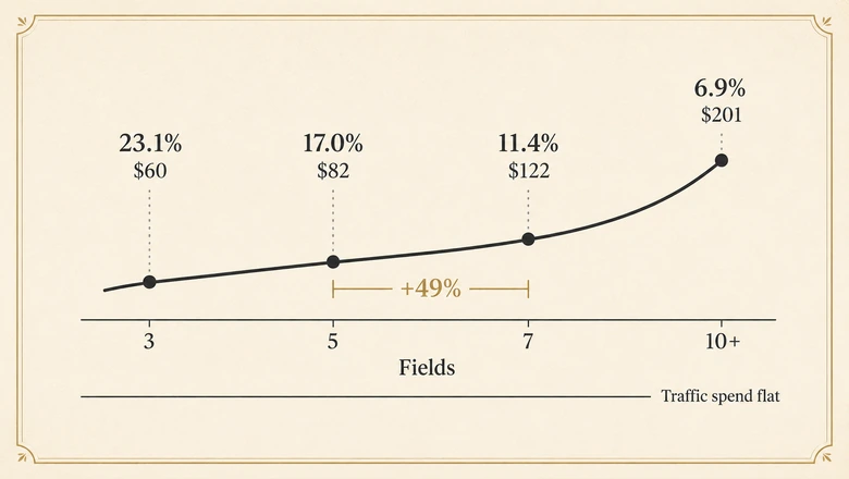
An added field costs you the ratio between the two conversion rates, not the difference between them. This is the arithmetic that turns a design argument into a budget argument, and it works on any curve, including your own measured one.
New CPL = Current CPL × (Current conversion rate ÷ New conversion rate)Traffic cost per form view does not change when you add a field. Only the number of leads that cost buys changes, so cost per lead moves by the inverse of the conversion ratio. Applied to the most widely reprinted curve, holding traffic spend constant:
| Fields | Conversion rate used | CPL multiplier vs 3 fields | CPL at a $60 baseline |
|---|---|---|---|
| 3 | 23.1% | 1.00× | $60 |
| 5 | 17.0% | 1.36× | $82 |
| 7 | 11.4% | 2.03× | $122 |
| 10+ | 6.9% | 3.35× | $201 |
The conversion rates in that table are Digital Applied’s published figures, used here as an illustration of the arithmetic and not as an IVRIS benchmark. The $60 baseline is a worked example, not a market rate. The structural finding survives whichever curve you substitute: the cost of a field compounds, because each one operates on a base already reduced by the ones before it. Going from five fields to seven costs more than going from three to five, even though both add two fields.
That is the number to take to whoever keeps asking for job title and company size. The question is not whether the extra data is useful. It is whether it is worth 49% more per lead, which is what the five-to-seven move costs on this curve.
Which benchmark applies to your form
Pick the benchmark whose denominator matches the decision you are making. Each of the four measures something different, and using the wrong one produces a confident answer to a question you were not asking.
- Use form-start completion when you are judging the form itself: field count, validation, mobile layout. It isolates form design from traffic quality. Compare against 42.7% to 67.4% by sector.
- Use form-view completion when you are judging whether the form is worth starting: its length on arrival, what it asks for, whether the value exchange is clear before the first keystroke.
- Use landing page conversion when you are judging the page and offer together, and when reporting to people who own the page rather than the form. Compare against the 6.6% median.
- Use session-based conversion only for acquisition spend decisions, and only if you know whether calls are in the numerator.
- Avoid entirely: any cross-denominator comparison, any figure without a stated population, and any single “average form conversion rate” presented without a form type attached.
For B2B lead capture specifically, form-start completion is usually the right instrument, because it separates the form from traffic quality, and traffic quality is the variable most likely to be moving underneath you. Once the form is submitted, the relevant benchmarks shift to what proportion of captured leads reach a booked meeting, which is a different measurement problem with a different set of published figures.
Why your number will not match any of these
Benchmarks assume your measurement is sound, and for forms that assumption fails more often than it holds. Before concluding that your form underperforms, rule out the four failure modes that make a working form look broken.
The first is silent failure. A form that renders correctly, accepts input and shows a success message can still fail to write the record, and the analytics event usually fires on the success message rather than the write. The conversion rate looks fine while leads disappear, or the reverse. Anything that breaks the path between a form submission and the record that captures it puts a gap between what you measure and what you have.
The second is definitional drift inside your own stack. Your form platform reports completions from starts, your analytics platform reports them against sessions, and your CRM counts deduplicated records. Three systems, three denominators, three numbers, all correct. Pick one as the reported metric and label it.
The third is bot traffic in the denominator, which inflates views and starts without ever producing a submission, and which is heaviest on exactly the pages that get the most inbound links.
The fourth is hidden field failure. Tracking parameters that fail to populate do not usually break the submission, so nothing looks wrong, but the resulting records arrive unattributed and get excluded from channel reporting downstream. Hidden fields that stop capturing UTM data are the common cause, and the check belongs in the same pass as verifying that campaign links carry their parameters before launch.
Run those four checks first. A form measured wrong will beat or miss any benchmark on this page by a margin that has nothing to do with the form.
Frequently Asked Questions
It depends entirely on the denominator. Measured from form starts, published sector figures run 42.7% to 67.4%. Measured across landing page visitors, the median is 6.6%. Measured from website sessions, 5.13%. A single number without its population attached cannot tell you whether your form is good.
Zuko Analytics publishes the largest dataset with disclosed methodology, covering 60 million form starts and 38 million completions. Completion from form start runs 42.7% for enquiry forms to 60.7% for registration forms. That dataset skews heavily toward financial services, forex and gambling, and toward mobile.
As a session-based rate it sits below the 5.13% cross-industry average, though retail and travel run lower at 2.4% and 1.9%. As a form-start completion rate it would be alarming, since published sector figures start around 42%. The same 2.5% is either mediocre or broken depending on what it divides by.
Fewer, but no public dataset supports a specific optimum for B2B. The widely quoted three-field rule derives from a HubSpot analysis that published graphs rather than figures. The original research found field type mattered more than count, with free-text areas and dropdowns depressing conversion most.
Because they measure different populations under one label. Form starts, form views, landing page visitors and website sessions produce figures roughly tenfold apart from identical performance. Some published rates also count phone calls as conversions. The disagreement is definitional rather than empirical.