
Google’s AI Overview for demo conversion rate benchmark currently answers with six numbers: 0.5-2% of cold traffic, 30-50% form completion, 60-80% demo-to-opportunity, 10-30% demo-to-close, 43-67% interactive demo completion, and a set of bands by contract value. Five publishers, five denominators, one heading.
Not one of those figures is invented. They are just answers to different questions, stacked as though they describe one funnel. A rate measuring whether someone finished a self-guided product tour is sitting beside a rate measuring whether a company signed a contract, and the reader is invited to treat both as “demo conversion”.
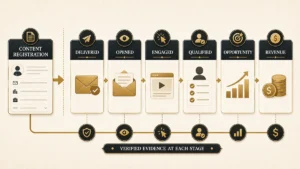
A demo request passes through six separate measurement events before it becomes revenue. This page files every published figure under the exact event pair it measures, keeps its sample and data period attached, and says plainly which of the six stages the public record can support and which it cannot. Two of six can be quoted. Four cannot, and pretending otherwise is how a board deck ends up with a fabricated target.
Direct answer — What is a good demo conversion rate benchmark?
There is no single demo conversion rate. The label covers six different transitions, and only two have public evidence strong enough to quote. Qualified demo requests book meetings at roughly 62% to 75.6% inside vendor-customer scheduling workflows. Chili Piper’s published counts put whole-funnel yield, from every form submission to a booked meeting, at 44.3% in its 2024 report and 57.3% in its 2025 report. Booked-to-held, held-to-opportunity and demo-to-close have no defensible public band.
Key Takeaways
- Only two of the six demo-funnel transitions have public evidence you can quote, and both come from a single publisher’s customer base. The other four are empty, which is a finding rather than a gap to fill with estimates.
- Chili Piper published two reports on the same metric in consecutive years. Between them, disqualification fell 16.6 points while qualified-to-booked rose only 2.7 points. Whole-funnel yield jumped 13.0 points, almost entirely because the qualification rule changed.
- That is the only genuine year-over-year comparison in this evidence base, and it means a rising demo conversion rate is at least as likely to signal looser filtering as better selling.
- Chaining the two stages RevenueHero publishes separately widens the gap between industries from 22.7 points to 39.9 points. The headline metric hides most of the difference.
- In the most-cited attendance snapshot, 1,114 of 6,428 meetings carry no disclosed terminal state. So 76.1% completed is not a show rate, and 100% minus the 6.5% no-show rate is wrong by 17.3 points.
- Reschedules are a terminal status in HubSpot and an overlay in RevenueHero. The same real meeting produces a different reported completion rate depending only on which system recorded it.
A demo funnel is six measurements, not one rate
Demo conversion rate is not a metric. It is a label applied to any of six distinct transitions, each with its own numerator, denominator and failure mode.
The confusion is structural rather than careless. A marketer measuring landing-page performance, a sales operations lead measuring scheduler behaviour and a founder measuring win rate all use the same three words for numbers that differ by a factor of twenty. Each is right within their own system. The damage happens at the moment of comparison.
| Stage | Transition | What divides what | The record you must keep |
|---|---|---|---|
| T1 | Visitor to demo request | Form submissions ÷ visitors | Identity method, bot and internal filters, and whether the denominator is sessions or users |
| T2 | Submission to qualified | Qualified submissions ÷ all submissions | The qualification rule, its version, and the timestamp of the decision |
| T3 | Qualified to booked | First booked meetings ÷ qualified requests | Meeting ID, booking timestamp, and first-booking versus all-bookings policy |
| T4 | Booked to held | Completed meetings ÷ outcome-eligible bookings | Final status, the grace period, and which bookings were still pending at the data cut |
| T5 | Held to opportunity | New opportunities ÷ held meetings | The opportunity-creation rule and a one-per-account or one-per-meeting policy |
| T6 | Demo to customer | Closed-won ÷ demo-sourced opportunities | The close window, and whether you are counting logos, contracts or deals |
Two boundaries do most of the work. The first sits at T2, where the denominator either includes every submission or only the ones that survived a filter you defined yourself. The second sits at T4, where a calendar invitation stops being a promise and becomes an event that either happened or did not. Nearly every incompatible benchmark comparison in this subject crosses one of those two lines. The upstream definitions themselves belong to the wider stage architecture that separates leads, opportunities and customers, and the qualified-lead boundary at T2 is the same one that makes MQL and SQL non-interchangeable across companies.

Which demo-funnel stages have publishable public evidence
Public evidence supports a quotable band at two of the six demo-funnel stages, and both of those come from vendor-customer platform data rather than a market sample.
We scored every source on six binary disclosure criteria: sample, population, data period, metric definition, methodology and primary access. Disclosure was scored separately from provenance, because the two are not the same thing. Optifai scores 5 out of 6 and is cited by the AI Overview, yet its own methodology page states that segment-level figures are “derived from industry patterns, not direct measurement of all 939 companies”. A page can be admirably transparent about being an estimate.
| Stage | Quotable public band? | Best available evidence | Why it does or does not hold |
|---|---|---|---|
| T1 Visitor to request | No | Daydream: 1.5-4%, or 5-7% high-touch | No sample count, no data period, no method, and an agency client cohort. The denominator unit is never stated. |
| T2 Submission to qualified | Single publisher only | Chili Piper: 69.3% qualified in its 2024 report, 85.9% in its 2025 report | Real counts, but the qualification rules belong to each customer, so this measures filter settings as much as lead quality. |
| T3 Qualified to booked | Yes, with caveats | 62% to 75.6% across RevenueHero, Chili Piper and Default | Three large datasets, all of them customers of a scheduling vendor. A performance envelope for one operating model, not a market average. |
| T4 Booked to held | No | One immature one-week snapshot | The cohort still contained meetings scheduled in the future, so no rate from it is terminal. |
| T5 Held to opportunity | No | Nothing qualified | The 60-80% figures circulating carry no sample, no method and no source location per cell. |
| T6 Demo to customer | No | SaaStr 10-20%; Monetizely 5-25% by contract value; Optifai 25% | Practitioner judgment, an unsourced band, and a self-declared synthetic estimate. None is measured platform data. |
Four empty rows in a benchmark table look like a failure. They are the most useful part of the page. A team that knows no public held-to-opportunity band exists will build a cohort and measure their own, which is the correct answer. A team handed 60-80% will compare against a number nobody can trace and act on the difference. The inverse case is worse still, because a full table of mutually incompatible numbers does more damage than four blank cells: nothing signals to the reader that the rows were measured against different populations. The same shape holds across the wider lifecycle, where only one of the five stage boundaries has channel-segmented evidence behind it and the remainder are published as industry aggregates.
Stage T1 carries a second problem that has nothing to do with the published rates. Before a visitor-to-request rate means anything, the submission has to survive the trip from browser to CRM intact, and form payloads and CRM receipts disagree more often than most teams check. A benchmark applied to a leaking capture layer measures the leak.

What happened to Chili Piper’s numbers between 2024 and 2025
Chili Piper is the only publisher in this subject to release the same metric on two consecutive cohorts, which makes its two reports the only genuine year-over-year comparison available.
The 2024 report published three raw counts: 2,948,575 form submissions, 2,042,453 qualified submissions and 1,307,505 booked meetings. The 2025 report, published on 18 February 2025 against calendar-year 2024 data, reported 561,977 disqualified submissions at 14.1% and a 66.7% qualified-to-booked rate across nearly four million submissions. Put the two side by side and the same publisher, measuring the same thing, describes a very different funnel.
| Measure | 2024 report | 2025 report | Change |
|---|---|---|---|
| Form submissions | 2,948,575 (reported count) | 3,985,652 (IVRIS calculation from 561,977 ÷ 0.141) | Larger cohort |
| Disqualification rate | 30.731% (IVRIS calculation) | 14.1% (reported) | -16.6 points |
| Qualified to booked | 64.016% (IVRIS calculation) | 66.7% (reported) | +2.7 points |
| All submissions to booked | 44.344% (IVRIS calculation) | 57.295% (IVRIS calculation) | +13.0 points |
Source: Chili Piper 2024 and 2025 benchmark reports. Values marked IVRIS calculation are computed from the counts and rates each report printed; the reports themselves publish neither the whole-funnel yield nor the comparison.
All submissions to booked = (1 − disqualification rate) × qualified-to-booked rateThe headline metric moved 2.7 points. The metric that describes what the funnel actually produced moved 13.0 points. The difference is not selling, scheduling or speed. It is the qualification rule: roughly one in three submissions was filtered out in the earlier cohort, against roughly one in seven in the later one. Loosen the filter and the whole-funnel yield rises while the headline rate barely moves, because a rate calculated on qualified records is largely insulated from how many records qualify.
IMPORTANT
A demo conversion rate that improves year over year is not evidence that anything improved. Check whether the disqualification rate moved first. If it fell, some or all of the gain is reclassification.
This also settles a discrepancy a careful reader will find between two IVRIS pages. Our breakdown of how one set of published counts yields 64.0% or 44.3% uses the 2024 report; the 57.3% figure derives from the 2025 report. Both are correct. They describe consecutive Chili Piper cohorts under different qualification settings, and neither is a market average. Anyone quoting a single Chili Piper whole-funnel number should say which year it came from.
Industry benchmarks change shape when you chain the two stages
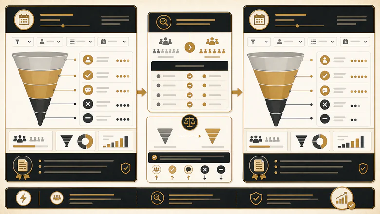
Industry demo benchmarks are usually published as a single qualified-to-booked rate, which conceals how much of the difference between sectors happens before that stage.
RevenueHero’s 2025 industry analysis is unusual in publishing both halves: a qualification rate and a qualified-to-booked rate for each sector. Multiply them and you get the transition a marketer actually cares about, which is the share of demo requests that reach a booked meeting. The source does not print that column.
| Industry | Qualification rate | Qualified to booked | Request to booked (IVRIS calculation) |
|---|---|---|---|
| Real Estate Software | 93.84% | 73.78% | 69.24% |
| Healthcare | 52.11% | 61.26% | 31.92% |
| Travel | 57.38% | 51.10% | 29.32% |
Source: RevenueHero, 6 May 2025, based on demo requests from its B2B software customers. These are the only three industry rows the page states in text. Sample size per row is not disclosed. The request-to-booked column is an IVRIS product of the two published columns and assumes they describe the same cohort.
On the headline metric, Healthcare and Travel look ten points apart. Chained, they are 2.6 points apart, while Real Estate Software pulls away from both. The spread across these three sectors widens from 22.7 points to 39.9 points once the qualification stage is carried through. The published column understates the real difference between industries by more than seventeen points.
There is a second reason to treat all published industry tables in this subject carefully. Both of RevenueHero’s benchmark tables, the 2025 one and the 2026 update, are published as embedded images rather than as text. We confirmed this by fetching both pages on 24 July 2026. Most rows exist only inside a screenshot, so they cannot be copied, checked, recalculated or read by the AI systems now answering this query. That is why secondary pages tend to repeat the same handful of sectors: those are the rows that appear in prose.
Booked is not held, and the gap is larger than the no-show rate
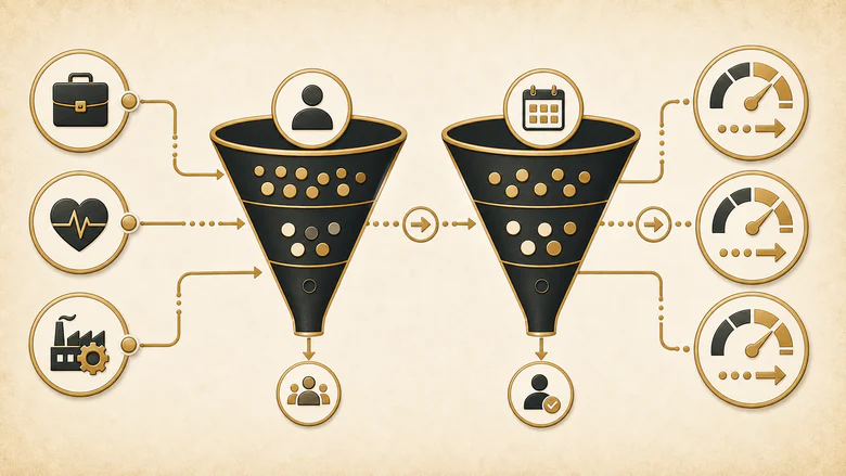
A booked meeting is a calendar record, and a held meeting is an outcome assigned after the scheduled time has passed. Treating one as a proxy for the other is the most common denominator error in this subject.
The most-cited attendance figures come from RevenueHero’s December 2024 snapshot of 6,428 scheduled meetings across 15 industries: 4,895 completed and 419 no-shows, reported as 76.1% and 6.5%. Those two counts leave 1,114 meetings, or 17.330% of the cohort, with no disclosed terminal state. The page says as much, noting that some meetings were “still scheduled and set to happen in the future”.
Held rate = completed meetings ÷ outcome-eligible bookings (pending excluded)So the familiar shortcut fails twice over. Subtracting the 6.5% no-show rate from 100 gives 93.5%, which overstates the observed completion figure by 17.3 points. And 76.1% is not a show rate either, because its denominator still contains meetings that had not yet happened. Neither number is a benchmark. The snapshot is valuable for a different reason: it is a clean demonstration that cancelled, rescheduled and pending bookings occupy real space between booked and held, and any funnel model without somewhere to put them will silently misreport.
The vendors themselves disagree about how to record this. HubSpot offers Scheduled, Completed, Rescheduled, No show and Canceled as options in a single outcome dropdown, so a meeting moved once and then attended can carry only one of them. RevenueHero’s webhook keeps status values of upcoming, no_show, cancelled and completed, with last_rescheduled_at and reschedule_count as separate fields. The same real meeting therefore lands as “rescheduled” in one system and “completed with one reschedule” in the other. Reschedule belongs on an overlay, not in the terminal status set, and the acceptance and outcome discipline this needs is the same one behind a defensible sales-accepted-lead definition.
Attendance rates, cancellation treatment and the full no-show evidence base are a separate subject with their own denominators, and this page deliberately stops at the boundary rather than publishing a show-rate benchmark the evidence cannot support.
What Google’s AI Overview gets wrong about demo conversion
The AI Overview for this query assembles six figures from five publishers into one answer, and no two of them share a denominator.
This matters more than a normal ranking argument. On a query like this one, the AI Overview is the answer most people receive, and it is currently teaching the market that these numbers belong in the same table.
| Figure shown | What it actually measures | Source and status |
|---|---|---|
| 0.5-2% traffic to demo, 8% retargeted | Landing-page visitor to form submission (T1) | Agency client cohort. No sample, no period, no method. |
| 30-50% demo request form completion | Form start to form submit, a sub-stage of T1 | No original source located. |
| 60-80% demo to opportunity | Held meeting to opportunity (T5) | Secondary synthesis. No sample or per-cell source. |
| 10-30% demo to close | Demo delivered to paid customer (T6) | SaaStr 10-20% is undated practitioner judgment; Optifai 25% is self-declared synthetic. |
| 43-67% interactive demo completion | Self-guided tour start to tour end. Not a meeting at all. | Walnut. The page returned HTTP 403 to our fetch on 24 July 2026, so the figure is unverified at source. |
| 15-25%, 10-20%, 5-15% by contract value | Demo delivered to paid customer (T6) | Monetizely, 3 July 2025. No sample or methodology disclosed. |
Three corrections carry most of the weight. A tour-completion rate is not a conversion rate, because a self-guided product experience never creates the scheduled-meeting event that the other figures depend on, and the same category error appears whenever AI demo agents are compared against live sales demos. SaaStr’s 10-20% is expert judgment from Jason Lemkin, offered with an explicit warning that the rate falls as funnel volume rises, which makes it unusable for comparison between companies. And demo-to-close bands sit five stages downstream of the booking rates they are printed beside, so quoting them together implies a funnel that nobody measured. Product-led motions add a further complication, since trial-to-paid conversion runs on a different path entirely and does not belong in a demo table.
How to benchmark your own demo funnel
Benchmarking a demo funnel means fixing one cohort, measuring each transition separately, and comparing only against published figures that share your start event, end event and workflow.
Workflow · 45 min
How to benchmark your demo funnel against public data
Produces a stage-by-stage rate set that can be honestly compared against a published benchmark, or shown to be incomparable.
Fix one cohort by entry date
Choose every submission to one named form between two dates. Follow that same set of records through all six stages. Never count meetings held this month against leads created this month.
Write down your qualification rule and version it
Record the exact exclusions, the rule version and the decision timestamp. Without this, your T2 and T3 rates cannot be compared with anyone else’s or with your own from last year.
Report both denominators at every stage
Publish the qualified rate and the all-submission rate side by side. One measures booking performance, the other measures what the funnel yields. Reporting only one hides either lead quality or execution.
Set an outcome window and exclude pending meetings
Pick a lag long enough for bookings to resolve, usually two to four weeks past the last scheduled date. Exclude anything still pending from the held-rate denominator, and report reschedules as an overlay rather than a status.
Match the workflow before comparing to any benchmark
Every quotable figure on this page comes from companies running instant qualification and self-scheduling. If a human replies to your demo requests by email the next day, those benchmarks describe a different operating model and your gap is architectural, not performance.
Step two is where most funnels fail before any measurement starts, because “qualified” is usually a shared assumption rather than a written rule. Three people will each describe the filter differently, and the difference between validation, qualification and scoring decides which records are even eligible for the denominator. Write the rule down before you calculate anything, because a rate computed against an undocumented filter cannot be defended six months later when the filter has quietly moved.
Step five is the one people skip. A 62% qualified-to-booked benchmark was produced by companies where a qualified buyer sees a calendar the instant they submit the form, so the comparison only holds if your buyers do too. Response latency decides that, and the response clocks between submission and first contact govern how many qualified requests ever reach a scheduler at all. Where the workflows genuinely differ, the honest reading is that you are looking at an architectural gap rather than a performance one, and no amount of coaching closes it.
Once the stages are measured separately, work on the stage carrying the largest absolute loss rather than the worst-looking percentage. A 90% rate on a stage handling 4,000 records loses more meetings than a 40% rate on a stage handling 300, and our guide to diagnosing which stage is actually losing the meetings takes the numbers produced here and turns them into a ranked fix list.
PRO TIP
Run the whole exercise twice, once with your current qualification rule and once with no filter at all. The distance between the two numbers is the size of the claim your reporting is making about lead quality.
Methodology, sources and revision history
Every figure on this page comes from a public third-party source, re-opened and re-verified on 24 July 2026. IVRIS did not run any of these studies, and the original organisations own their research.
How sources were scored and compared
Each source was scored 0 to 6 on disclosure: sample, population, data period, metric definition, methodology availability and primary-source access. Provenance was recorded separately, because a page can disclose its method fully and still be an estimate rather than a measurement. Two figures were treated as comparable only when the start event, end event, outcome maturity, workflow, population, cohort window and aggregation method all survived inspection. Where events matched but context differed, the figures are shown side by side and never averaged. Values calculated by IVRIS from published counts are labelled as such in the body, in every table and in the downloadable ledger, and the inputs are always printed beside the result so any reader can reproduce them.
What was excluded and what limits apply
Excluded: Chili Piper’s 30% “industry average” comparator, which has no original source; secondary pages repeating another publisher’s dataset as though it were independent confirmation; any figure whose primary source could not be opened. Two sources are labelled rather than dropped. Default’s report page returned HTTP 404 to our fetch on 24 July 2026, so its 75.6% figure is carried from the report’s published summary and marked unconfirmed at source. Walnut’s page returned HTTP 403, so its completion figures are described but not adopted.
Three limits apply throughout. Every quotable rate here comes from companies that were already customers of a scheduling or routing vendor, which is an operating model rather than a market. No source discloses geographic composition, so no country-level figure is possible. And qualification rules are set by each individual customer in all three of the large datasets, which means T2 and T3 measure filter settings as much as they measure performance.
Citation, review date and revision history
Suggested citation: IVRIS, Demo Conversion Rate Benchmarks, demo-funnel benchmark ledger v1.0, ivristech.com, updated 24 July 2026. The full stage-indexed ledger is published as XLSX and CSV, with every source’s start event, end event, sample, period, transparency score, provenance class and use decision, so any figure above can be traced or recalculated.
Last reviewed: 24 July 2026. Revision history: v1.0, 24 July 2026, first publication; all sources fetched and verified against their original publication before release. Review cadence is quarterly for the SERP and source-accessibility audit, six-monthly for calculation checks, and annually for a full refresh. An immediate revision is triggered when any publisher releases a new cohort, restates a denominator, discloses per-row sample sizes, publishes an outcome-mature attendance cohort, or takes a cited source offline.
Frequently Asked Questions
It depends which of six transitions you mean. For qualified demo requests booking a meeting, large platform datasets report 62% to 75.6%. For every form submission reaching a booked meeting, Chili Piper’s counts give 44.3% in 2024 and 57.3% in 2025. For demo to closed customer, no defensible public band exists.
Divide the end event by the start event over one fixed cohort, then name both events beside the result. Booked meetings divided by qualified requests is a different metric from booked meetings divided by all submissions. Report both, and record the qualification rule version that separates them.
No. Booked is a calendar record; held is an outcome assigned after the scheduled time. In the most-cited public snapshot, 76.1% completed and 6.5% no-showed, leaving 17.3% of meetings with no disclosed terminal state. Cancellations, reschedules and pending bookings sit in that gap.
Mostly because the qualification rate changed. Disqualification fell from 30.7% to 14.1% between its 2024 and 2025 reports while qualified-to-booked rose only 2.7 points. Whole-funnel yield rose 13.0 points as a result. Check the disqualification rate before reading any year-over-year improvement as better performance.
No. A self-guided or on-demand demo never creates a scheduled-meeting event, so completion rates for product tours cannot be compared with booking or attendance rates. Claims that on-demand demos have a zero no-show rate describe the removal of the meeting, not an improvement to the same metric.