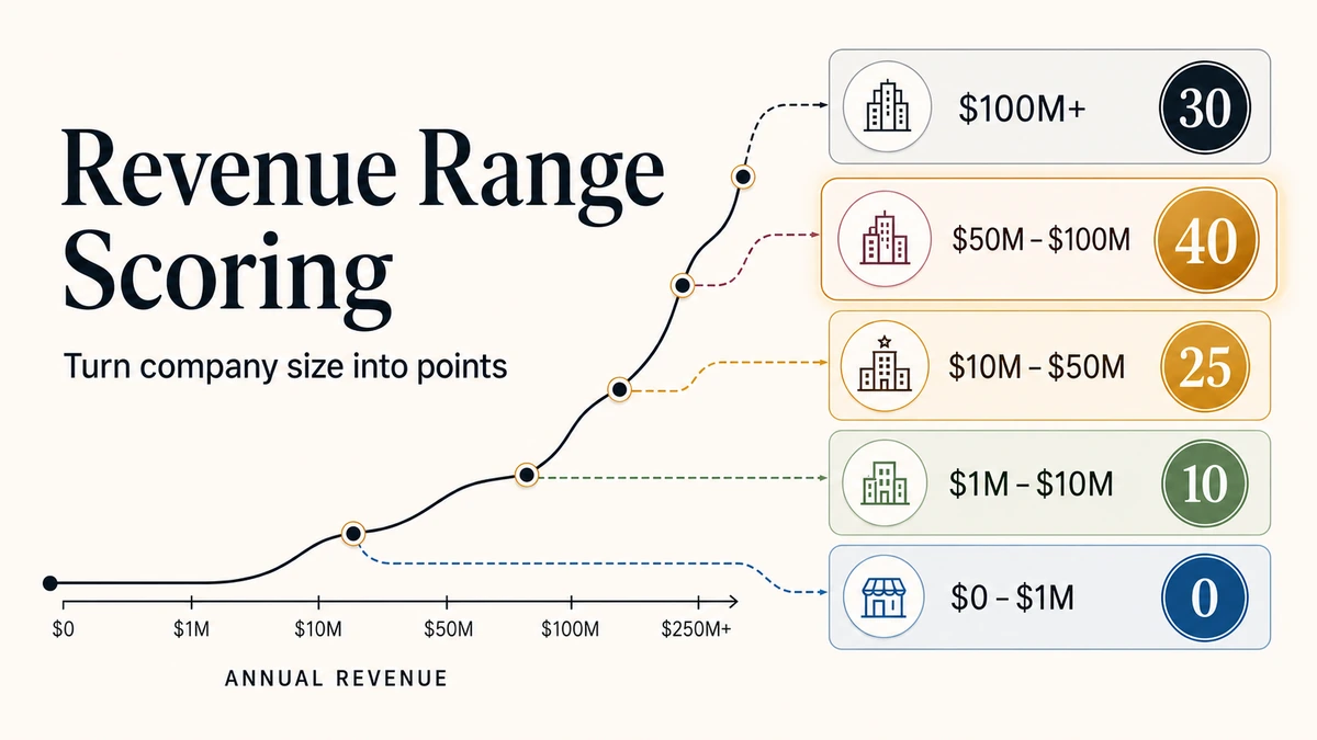
Assigning points to revenue ranges means slicing company revenue into brackets and giving each bracket a fixed score, so a lead’s size feeds your model instead of sitting in a cell as raw data. A revenue figure like $4,238,000 tells a salesperson something useful; it tells a scoring formula nothing until you bucket it into a tier worth, say, 25 points.
Knowing how to assign points to revenue ranges, or how to map revenue to scores, is the translation step where a lot of B2B teams stall. They know bigger accounts usually matter more, but “usually” doesn’t scale across 10,000 records. You need brackets with defined edges, a point value for each one, and a single formula that scores every row the same way. Put those three together and you have a revenue range scoring system: a repeatable rule that turns any company’s size into the same score every time.
It matters because sales attention is the scarcest resource you have. Most B2B traffic never converts (software sites turn visitors into leads at 7.6% and professional-services sites at 6.1%, per Ruler Analytics’ May 2026 benchmark of 110 million sessions), and the leads that do arrive can’t all get the same follow-up. Points on revenue ranges are how you tell your team which accounts earn a same-day call and which go to a slower follow-up queue.
Every table on this page can be downloaded as a CSV, and there’s an editable revenue-range scoring workbook with working Excel and Google Sheets formulas further down.
Direct answer – mapping revenue bands to scores
Mapping revenue bands to scores means dividing company revenue into a few brackets and giving each bracket one fixed point value, so size becomes a usable scoring signal. Design it in three moves: set 3 to 5 brackets at your ICP’s revenue floor and ceiling, cap revenue’s top score so it can’t qualify a lead alone, and pick an allocation style (linear, tiered to the top, or weighted to your best-fit band) that matches how fit changes with size.
Key Takeaways
- A revenue range is a bracket; each bracket gets one fixed point value, which turns company size into a usable scoring signal.
- Use 3 to 5 scoring tiers, not 10. More tiers add noise, not accuracy — even when your enrichment vendor hands you eight bands.
- Set your cut points at the edges of your ideal customer profile: below your floor scores 0 or negative, your sweet spot scores the maximum.
- Pick an allocation style on purpose: linear, tiered to the top, or weighted to your best-fit band.
- Automate it with a VLOOKUP approximate match (or IFS / XLOOKUP) so one formula scores every record in the sheet.
- Handle revenue stored as text (“$1M-$5M”, “$200M+”) before you score it, or the lookup silently reads it as zero.
- Cap revenue at roughly 10 to 40% of the total score depending on your motion, and let behaviour carry the rest.
Allocation styles for mapping revenue bands to scores
Before you pick point values, decide how the points should spread across your bands. The three allocation styles below cover the choices that matter for a B2B revenue-range score.
| Allocation style | What it is | Use when | Avoid when |
|---|---|---|---|
| Linear | An equal point step per band, so each larger bracket is worth a fixed amount more (e.g. 10 / 20 / 30 / 40). | Buyer fit rises steadily with company size and your biggest accounts really are your best. | Your largest accounts are slow or hard to service, or only your sweet spot is worth real sales effort. |
| Tiered to the top | Small, flat scores for the lower bands and a big jump at the top (e.g. 5 / 10 / 25 / 40). | Only your sweet spot and up justify a rep’s time, and small accounts barely move the needle. | Smaller accounts still convert well, or you want the score to separate the lower bands from each other. |
| Weighted to best-fit | Points peak at your best-fit band and dip for accounts that are too big, forming an inverted U (e.g. 10 / 25 / 40 / 20). | Your largest companies bring procurement cycles or service demands you can’t support and convert worse than your sweet spot. | Bigger genuinely is always better for you, or stakeholders will misread the top band scoring lower than the one beneath it. |
How to choose your brackets and allocation style
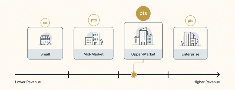
- Use 3 to 5 brackets when you want a signal that’s legible and defensible to sales: a below-floor band, two or three positive bands, and sometimes a discounted enterprise band on top.
- Use linear when fit rises steadily with size and you have no service ceiling, since an even step is the safe default for a first model.
- Use tiered-to-top when small accounts genuinely aren’t worth a rep’s time and only your sweet spot and above deserve real point weight.
- Use weighted-to-best-fit when your largest accounts are slow to close or expensive to serve, so they shouldn’t outscore the accounts you actually win.
- Avoid 10 brackets (or any count above five) because the gap between a $22M and a $24M company isn’t real signal; narrow bands add noise, not accuracy, and are hard to explain.
What it means to assign points to revenue ranges
Assigning points to revenue ranges is the practice of dividing a continuous revenue figure into brackets and giving each bracket a fixed score. It converts company size into a value your lead-scoring or account-tiering model can act on.
The reason you bracket at all is that a model can’t reason about a raw number. “$4.2M” is not an instruction. “Tier 3, worth 10 points” is. Brackets compress thousands of distinct revenue values into a handful of bands you can reason about, defend to sales, and update in one place. Revenue bands and revenue ranges mean the same thing in this scoring context, whichever label your CRM or enrichment tool uses. The revenue figure only lands in that field in the first place through the enrichment that fills it from third-party sources when a form never captured it.
The same math shows up in three B2B jobs. In lead scoring, revenue is a firmographic signal that sits next to industry, headcount, and job title. In account tiering for ABM, the brackets decide who lands in Tier 1 versus Tier 3. In sales-performance and territory work, revenue bands set quota weighting. Customer-loyalty and spend tiers use the identical bracket-and-points structure, just pointed at spend instead of company revenue. That works because revenue is only one firmographic signal among industry, size, location, and the account’s tech stack, so it earns points but rarely decides the score alone.
How to score companies by revenue ranges: the four-part scoring system
A revenue range scoring system is four moving parts, not one table. Most teams build part two, skip the rest, and then wonder why the scores drift. Getting all four right is what makes the scoring logic for business revenue repeatable instead of a spreadsheet somebody maintains by hand.
| Component | What it holds | Where it lives | Breaks when |
|---|---|---|---|
| 1. The revenue input | One annual revenue figure per company — either a number, or a text band like “$1M-$5M”. | A CRM field, filled by a form, an import, or an enrichment provider. | The field is blank, stale, or a string your formula quietly reads as zero. |
| 2. The reference table | Bracket lower bounds, tier labels and point values, sorted ascending. | A locked tab in the scoring workbook, or a lookup table in your CRM or CDP. | Someone re-sorts the rows, or adds a band without giving it a point value. |
| 3. The match rule | The logic that picks exactly one bracket per company: approximate-match lookup, or first-match top-down conditions. | The formula in your points column, or the rule set in your scoring tool. | Brackets overlap, or nothing catches values below your floor. |
| 4. The output | A point value that feeds the total score, plus a tier label a rep can actually read. | The scored record, then the routing and alerting rules downstream. | The tier label and the points drift apart after someone edits one and not the other. |
Build them in that order. The input decides what your formula can even see, the reference table holds the business decision, the match rule enforces it consistently, and the output is what sales reads. Skip the input step and you will score a large share of your database as $0 without noticing.
Check that your revenue input is actually a number
Enrichment providers rarely hand you a clean figure. ZoomInfo, Apollo, Clearbit and most CRM pick-lists store the field as a string: $1M-$5M, 10-50M, $200M+. An approximate-match lookup cannot read a string, so it returns your bottom band and a $200M account looks tiny.
There are two ways out, and both are a data job rather than a scoring one. Either match the vendor’s band strings directly against a lookup table, or convert each string to its numeric lower bound and score that number. The step-by-step versions — in Excel, SQL and Python, including how to handle overlapping and unknown bands — sit in the companion guide on parsing and normalising revenue-band strings. Settle that first, then come back here to decide what each band is worth.
IMPORTANT
Whichever route you take, audit the field before you trust it: sort the column, count the distinct values, and confirm every one is handled. A blank cell, a newly added vendor band, or a $500K or $1B string your rule doesn’t recognise will all resolve to your bottom tier with no error to warn you — a data problem that looks exactly like a small company.
A full mapping: $0-1M through $200M+
Here’s a complete map from a typical enrichment band list to points. Note what it does: the provider gives you eight bands, but you still only run five scoring tiers. The bands belong to the vendor; the tiers belong to you.
| Band as stored | Numeric lower bound | Scoring tier | Points |
|---|---|---|---|
| Blank / unknown | — | Flag for enrichment | 0 |
| $0-$1M | 0 | Below ICP floor | 0 |
| $1M-$5M | 1,000,000 | Tier 3 (emerging) | 10 |
| $5M-$10M | 5,000,000 | Tier 3 (emerging) | 10 |
| $10M-$20M | 10,000,000 | Tier 2 (core) | 25 |
| $20M-$50M | 20,000,000 | Tier 2 (core) | 25 |
| $50M-$100M | 50,000,000 | Tier 1 (sweet spot) | 40 |
| $100M-$200M | 100,000,000 | Tier 1 (sweet spot) | 40 |
| $200M+ | 200,000,000 | Enterprise (slower close) | 30 |
A company in the $10M-$20M band scores 25 — the same as one at $45M — because both sit inside the same commercial reality for this seller. That’s the point of tiering. If $12M and $45M accounts genuinely behave differently in your win data, split them; if they don’t, collapsing them keeps the model honest and easy to defend.
How to assign points to revenue ranges (step by step)
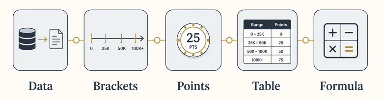
To assign points to revenue ranges, choose the revenue metric, cut it into brackets at your ICP edges, give each bracket a point value, build a sorted reference table, and let one formula apply it. The five steps below take about 15 minutes the first time and run on autopilot after that.
Set your brackets at the edges of your ICP
Cut points should land where buyer fit actually changes, not on round numbers that look tidy. If you sell to mid-market and the deals stop making sense below $5M and above $250M, those two numbers are your outer edges. Everything below the floor scores 0 (or goes negative if those leads waste sales time), and your best-fit band in the middle scores the most. The cleanest way to find those edges is to look at where your ideal customer profile’s revenue floor and ceiling sit in your actual closed-won data, then draw the brackets around them.
Find the cut points in your own win data
“Draw the brackets around your ICP” is easy to say. Here is the analysis that actually produces the numbers. Export every closed-won and closed-lost opportunity from the last four to eight quarters, group them into revenue segments, and calculate three things for each segment: win rate, median days to close, and net revenue retention. Your cut points sit wherever those numbers break.
| Revenue segment | Closed deals | Win rate | Median days to close | NRR | What it tells you |
|---|---|---|---|---|---|
| Under $1M | 47 | 6% | 41 | 78% | Below the floor. Score 0 — these consume cycles and churn. |
| $1M – $10M | 63 | 18% | 52 | 91% | Emerging. Worth a small positive score, not real sales effort. |
| $10M – $50M | 118 | 31% | 58 | 104% | Core. Reliable volume and expansion. |
| $50M – $250M | 96 | 37% | 61 | 112% | Sweet spot. Best win rate, best retention, cycle barely longer. |
| $250M+ | 38 | 19% | 129 | 108% | Win rate halves and the cycle doubles. Discount, don’t reward. |
Read that the way you’d read your own. Win rate climbs from 6% to 37%, then falls off a cliff above $250M while the sales cycle more than doubles. That shape is not a straight line, so a linear allocation would misprice the top segment badly. This business should weight to best-fit and discount enterprise — which is exactly what the scoring table in the next section does, and why its top band is 30 rather than 50.
Two rules keep the analysis honest. Use at least 30 closed opportunities per segment, or widen the segment until you have them; an 12% win rate drawn from eight deals is noise wearing a percentage sign. And group each account by the revenue it had when it entered the pipeline, not by today’s figure — otherwise your fastest-growing customers quietly inflate the band above the one they actually bought in, and you’ll set your sweet spot one tier too high.
Assign the point values
With the edges set, give each band a score. Keep it to 3 to 5 bands so the signal stays legible. Here’s a working revenue-range scoring table for a mid-market B2B seller, with the sweet spot scoring highest and very large accounts scoring slightly lower because they take longer to close and service.
| Annual revenue (lower bound) | Tier | Points |
|---|---|---|
| $0 | Below ICP floor | 0 |
| $1,000,000 | Tier 3 (emerging) | 10 |
| $10,000,000 | Tier 2 (core) | 25 |
| $50,000,000 | Tier 1 (sweet spot) | 40 |
| $250,000,000 | Enterprise (slower close) | 30 |
Those point values aren’t arbitrary: revenue is one signal in a bigger set of scoring criteria, so its top score should be a deliberate slice of the total, not a runaway number. Deciding how much weight any single signal should carry is the part that keeps a model honest, and revenue is the signal teams most often over-weight.
Automate the scoring with a formula
Once the table exists, you never assign points by hand again. Put the revenue figure in a cell and let an approximate-match lookup find the right bracket. VLOOKUP with its last argument set to TRUE returns the points for the largest lower bound that’s less than or equal to the lead’s revenue, which is exactly the bracket logic you want.
=VLOOKUP(B2, $E$2:$G$6, 3, TRUE)Here B2 holds the lead’s revenue, E2:G6 is the table above (lower bound, tier, points), 3 is the points column, and TRUE switches on approximate match. A lead at $87M matches the $50M row and scores 40; a lead at $300M matches the $250M row and scores 30. If you’d rather hard-code the bands without a side table, an IFS function does the same job by checking the brackets from the top down. Checking the brackets from the top down is first-match logic by another name, so the moment you outgrow the spreadsheet you can run the same top-down rules in SQL and Python against the whole table at once.
=IFS(B2>=250000000, 30, B2>=50000000, 40, B2>=10000000, 25, B2>=1000000, 10, TRUE, 0)PRO TIP
Approximate-match VLOOKUP only works if the first column is sorted in ascending order. Both Microsoft and Google Sheets require it. One misplaced row and the formula returns the wrong tier silently, with no error to warn you. A blank revenue cell fails the same quiet way: VLOOKUP reads it as $0 and drops the lead into your bottom band, so choose whether unknown revenue should score zero or get flagged for enrichment instead.
XLOOKUP (with match mode set to “exact or next smaller”) and a nested IF do the same thing if your spreadsheet doesn’t have IFS. The lookup approach scales better: when your pricing or ICP shifts, you edit the table once and every row re-scores.
Free template
Revenue-Range Scoring Workbook
Editable Excel workbook with customisable revenue bands, automatic point assignment, working VLOOKUP and XLOOKUP formulas, the text-band parsing helper, and a complete worked lead-scoring example.
Workflow · 15 min
How to assign points to revenue ranges
Turn a raw company-revenue figure into a repeatable lead-score input in five steps.
Choose the revenue metric and clean the data
Pick annual revenue or ARR, then pull it from your CRM or an enrichment source. Convert text bands like “$1M-$5M” to numbers, and decide upfront how you’ll score records where revenue is missing.
Cut the revenue range into 3 to 5 brackets
Place your cut points at the revenue floor and ceiling of your ideal customer profile. Below the floor scores 0; the best-fit band sits in the middle.
Assign a point value to each bracket
Give your sweet-spot band the maximum and step the others down. Keep the top value to a deliberate share of the total possible score.
Build the sorted reference table
List each bracket’s lower bound and its points in two columns, sorted ascending by the lower bound. This table is what the formula reads.
Automate the scoring with VLOOKUP or IFS
Apply =VLOOKUP(revenue, table, points_column, TRUE) so every record scores itself. Use IFS or XLOOKUP if you prefer to hard-code the bands.
How many points should each revenue range get?
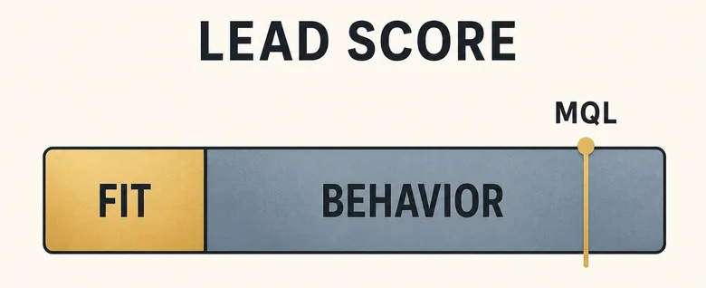
Each revenue range should get a point value sized to how much that band changes your odds of a good deal, capped so revenue never dominates the score on its own. A practical rule: let firmographic fit, revenue included, account for 30 to 40% of the maximum possible score, and leave the rest for behavior.
The logic is simple. Company size predicts whether a lead could be a good customer. Behavior predicts whether they’re ready to buy. A $40M company that perfectly fits your ICP but has never opened an email is a great prospect and a terrible “call them today” lead. If revenue points alone can clear your qualification bar, you’ll flood sales with big logos that aren’t paying attention.
That’s why the top revenue band in the table earns 40 points against a qualification threshold of 75: meaningful, but it can’t qualify a lead by itself. A SaaS team scoring product-qualified leads will tilt even further toward usage signals, which is why a product-led model leans harder on activation and feature adoption than on company size.
Where the rest of the points go
Revenue tells you the account is worth having. It says nothing about whether the person in front of you can buy. Most models pair the revenue bracket with a seniority score, because decision authority is the second firmographic signal that actually moves win rates.
| Role | Points | Why |
|---|---|---|
| C-suite / founder | 25 | Can sign, or kill it, without a second approval. |
| Vice President | 20 | Usually owns the budget line the purchase comes out of. |
| Director | 15 | Runs the evaluation and controls the shortlist. |
| Manager | 10 | Builds the internal case; matters most in groups. |
| Individual contributor | 5 | Researches and influences, rarely decides alone. |
One caveat worth building into the model: three engaged managers from the same account usually beat one silent VP. Buying committees decide together, so count distinct engaged contacts per account alongside the seniority of any single one. The full picture sits in the wider set of B2B lead scoring criteria.
Linear vs. tiered vs. weighted point allocation
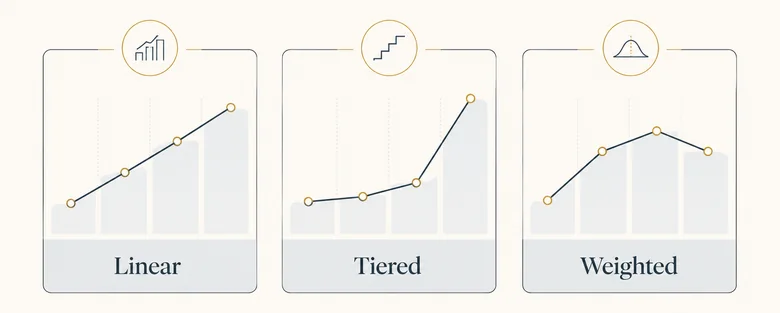
There are three ways to spread points across your brackets, and the right one depends on how buyer fit changes with size. Pick deliberately instead of defaulting to an even spread.
| Approach | How points scale | Best when | Example (4 bands) |
|---|---|---|---|
| Linear | Equal step per bracket | Fit rises steadily with company size | 10 / 20 / 30 / 40 |
| Tiered (top-weighted) | Bigger jumps near the top | Only your sweet spot is worth real sales effort | 5 / 10 / 25 / 40 |
| Weighted by fit | Peaks at the sweet spot, dips for too-big | Your largest accounts are slow or hard to service | 10 / 25 / 40 / 20 |
Linear is the safe default for a first model. Tiered makes sense when small accounts genuinely aren’t worth a rep’s time. Weighted by fit is the most honest for many mid-market sellers: the biggest companies on the list often have procurement cycles and service demands you can’t support, so they shouldn’t outscore the accounts you actually close.
Examples of revenue range scoring systems
The same method produces very different tables depending on what you sell. Here are three complete business scoring systems based on revenue ranges, each shaped by a different commercial reality. Find the one closest to your motion and start from its shape rather than from a blank sheet.
| Scoring system | ICP floor → ceiling | Bands and points | Revenue’s share | Why it’s shaped that way |
|---|---|---|---|---|
| Mid-market SaaS weighted to best-fit | $10M → $250M | $0-10M: 0 $10-50M: 25 $50-250M: 40 $250M+: 30 | ~30% | The $50-250M band closes fastest. Above $250M the procurement cycle needs a team this company doesn’t have, so the top band is discounted rather than rewarded. |
| Enterprise services tiered to the top | $250M → no ceiling | $0-50M: 0 $50-250M: 5 $250M-$1B: 15 $1B+: 45 | ~40% | Delivery cost is fixed and high, so a contract below $250M revenue rarely clears margin. Almost all the weight sits in the top band by design. |
| PLG / self-serve flat, low weight | No hard floor | $0-10M: 5 $10-100M: 10 $100M-$1B: 15 $1B+: 15 | ~10% | Signups convert on activation and seat expansion, not size. Revenue is a tiebreaker between two equally active workspaces, nothing more. |
Notice how far apart the top bands sit: 30 points in the first system, 45 in the second, 15 in the third. There is no universal revenue score. The number is only correct relative to what the rest of your model is worth and how your business actually makes money.
A worked example: revenue-range scoring in a B2B lead model
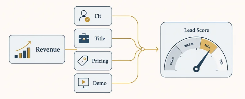
Here’s how revenue-range points behave inside a full lead score. Treat the table below as a small but complete revenue band scoring system. Take a real-looking lead: an $87M SaaS company, VP of Marketing, who visited the pricing page three times and requested a demo, from a free email domain.
| Signal | Detail | Points |
|---|---|---|
| Annual revenue range | $87M, Tier 1 sweet spot | +40 |
| Headcount | ~600 employees (don’t double-count size) | +5 |
| Industry fit | SaaS, inside ICP | +15 |
| Job title | VP of Marketing | +10 |
| Behavior: pricing page ×3 | High intent | +20 |
| Behavior: demo request | High intent | +25 |
| Negative: free email domain | Weak buying signal | -10 |
| Total | MQL threshold = 75 | 105 |
Notice that the firmographic signals alone (40 + 5 + 15 + 10 = 70) fall just short of the 75-point bar. It’s the behavior that pushes this lead over the line. That’s the model working as intended: revenue range earns the account a hard look, but engagement is what flips it from marketing to sales. Where that flip happens is the difference between an MQL and a sales-qualified lead your reps will actually accept, and revenue points should inform that handoff without forcing it.
When revenue should carry less weight
The 30 to 40% guideline is a default, not a law. Several common motions justify pulling revenue’s share down hard, and forcing a heavy revenue weight onto them produces a model sales stops trusting within a quarter.
| Situation | Revenue’s share | What carries the weight instead |
|---|---|---|
| Product-led growth | 5-15% | Activation events, feature adoption, seats added, workspace invites sent. |
| One product, several segments | 10-20% | Industry and use-case fit, because the same product legitimately sells at $5M and $5B. |
| Land-and-expand pricing | 10-20% | Expansion signals: team count, adjacent departments, usage trend after month one. |
| Mid-market speed advantage | 15-25% | Buying-committee engagement, since a shorter approval chain beats a bigger logo. |
| A segment you’re just entering | 10% or none | Intent and research behaviour, because you have no win history to draw brackets from yet. |
The test is simple. Pull your closed-won deals from the last four quarters, group them by revenue band, and check whether win rate actually separates the bands. If it doesn’t, revenue is not earning the weight you gave it, and those points should move to a signal that does separate them.
Predictive scoring inherits whatever bias is in your history
Predictive and AI-assisted scoring models learn brackets instead of asking you to draw them. Fed closed-won records, engagement history and sales-cycle length, they’ll surface the revenue ranges that correlate with revenue outcomes — often finding that behaviour predicts conversion better than company size does.
The catch is what the training data contains. If your reps spent three years working only enterprise accounts, your history holds enterprise wins and almost nothing else. The model learns “bigger is better,” reports it with confidence, and you route even more attention to enterprise — which generates more enterprise history for the next training run. The bias compounds and looks like a finding.
A cheap control: keep your hand-built weighted-by-fit table alongside the predictive score for a quarter and compare. If the model’s top decile is materially larger than the accounts you actually win, it’s fitting your past sales coverage rather than your real market. Predictive scoring earns its keep on behavioural signals, where the volume of data is genuinely beyond hand-tuning; on firmographics, a table you can read and defend usually holds up better.
Common mistakes when assigning points to revenue ranges
Most broken revenue-range models fail in the same few ways. Watch for these before you ship your scoring sheet.
Too many brackets. Ten bands feel precise but behave like noise, because the difference between a $22M and a $24M company isn’t real signal. Three to five bands capture the pattern and stay easy to explain to sales.
Round numbers instead of ICP edges. Cut points at $10M and $50M because they’re tidy, and you’ll split bands right through the middle of your best customers. Draw the edges from where your win rate actually changes.
Double-counting size. Revenue and employee count are highly correlated, so scoring both heavily means you’re rewarding company size twice and crowding out everything else. Pick one as your primary size signal and give the other a light touch.
Treating a big company’s traffic as intent. A 20,000-person company generates far more sessions than a 200-person one for reasons that have nothing to do with buying. Analysts, students, consultants, competitors and your own existing vendors all read the same pages. Add a high revenue score on top and the model manufactures a hot lead out of ambient curiosity. The fix is a floor: require a meaningful action — a demo request, a pricing view from a named contact, or two distinct engaged people at the account — before revenue points are allowed to compound with behavioural ones.
IMPORTANT
A big revenue score is not a qualified lead. A perfect-fit account with zero engagement still isn’t ready for a sales call. Confirm that the company is a real, reachable buyer with the validation checks that separate a fit from a genuine opportunity before your reps spend time on it.
Leaving unmapped values scoring zero. A blank field, a new vendor band, or a currency string your formula doesn’t recognise all resolve to your bottom tier without an error. Route unmapped records to an enrichment queue instead of scoring them, so a data problem never looks like a small company.
Set-and-forget brackets. Your ICP and pricing move, and stale brackets quietly mis-score every new lead. Tag the scoring table with a review date and revisit it each quarter so the points still match the business you want.
Frequently Asked Questions
Cut company revenue into 3 to 5 brackets at the edges of your ideal customer profile, give each bracket one fixed point value, then apply it with a single approximate-match formula so every record scores identically. Below your ICP floor scores 0, your sweet spot scores the maximum, and accounts above your service ceiling are usually discounted rather than rewarded.
The ones your own win data says convert best, which is rarely the largest. Group four to eight quarters of closed opportunities into revenue segments and calculate win rate, median days to close and net revenue retention for each. Score the segment where win rate peaks the highest, and discount segments where the cycle length doubles. Use at least 30 deals per segment or the percentages are noise.
A revenue range scoring system has four parts: the revenue input for each company, a sorted reference table of brackets and points, a match rule that picks exactly one bracket per record, and an output that feeds both the total lead score and a tier label sales can read. Most teams build only the reference table, which is why their scores drift.
Fix the data before you score it. Either match the vendor’s band strings exactly against a lookup table, or convert each string to its numeric lower bound and bracket that. The point values in this article apply either way — see parsing and normalising revenue-band strings for the Excel, SQL and Python steps. Never let an unrecognised string default to zero.
Use the band’s lower bound, $10,000,000, as the lookup value and give it whatever your core tier is worth — 25 points in the mid-market model on this page. A $10-20M company scores the same as a $45M one if both sit inside the same commercial tier for you. Only split them if your win data shows the two genuinely behave differently.
Between 10% and 40%, depending on your motion. Enterprise services can justify 40% because deal size tracks company size closely. Mid-market lands around 30%. Product-led and multi-segment businesses should drop to 10-15% and let activation, usage and intent carry the score instead.
Mapping revenue bands to scores is a three-step design choice: cut 3 to 5 brackets at your ICP’s revenue floor and ceiling, give each bracket one fixed point value, and pick an allocation style. Use linear for steady fit, tiered-to-top when only big accounts matter, or weighted-to-best-fit when your largest accounts convert worse.
Build a two-column reference table of each range’s lower bound and its points, sorted ascending. Then use =VLOOKUP(value, table, points_column, TRUE). The TRUE turns on approximate match, so Excel returns the points for the largest lower bound that’s still below your value. IFS or XLOOKUP work too.
Three to five. Fewer than three can’t separate small from ideal from oversized accounts, and more than five adds brackets so narrow they behave like noise. Your enrichment provider may supply eight or nine bands — collapse them into your own three to five scoring tiers rather than scoring each vendor band separately.
Yes. Revenue bands and revenue ranges describe the same thing: a bracket of annual company revenue with a defined lower and upper edge. Enrichment tools and CRMs often store them as text like “$1M-$5M”, and a revenue band scoring system maps each bracket to one fixed point value.
Revenue-based lead scoring assigns points to a company’s revenue range as a firmographic signal of fit. Larger, in-profile companies score higher because they’re more likely to become valuable customers. It works best combined with behavioral signals, since revenue predicts fit, not readiness to buy.
No. Companies above your service ceiling often bring long procurement cycles and demands you can’t meet, so they convert worse than your sweet spot. A weighted-by-fit allocation peaks at your best-fit band and discounts the largest accounts, which usually models real win rates better than a straight line.
Yes. Google Sheets uses the same VLOOKUP syntax with the is_sorted argument set to TRUE for approximate match, so the bracket logic is identical to Excel. XLOOKUP is also available in Sheets if you’d rather match on the next-smaller value without a sorted table.
Build your model
Start from a working table, not a blank sheet
Customise the revenue bands, point values and allocation style in the free workbook, then paste your own CRM export beside it and let the formulas score every row.