Nine publishers reported an average cold email reply rate in 2026. The lowest says 0.45%. The highest says 8.5%. That is a nineteen-fold spread on a single metric, and every one of those numbers is sitting on a page that presents it as the market benchmark.
Nobody is lying. The numbers disagree because they are not measuring the same thing, and almost none of the pages carrying them say so. We fetched all nine originals and traced each figure back to whoever actually collected it. Two of the most-quoted numbers turned out not to belong to the site publishing them.
Direct answer — what is the average cold email reply rate?
There is no single average. Published 2026 figures run from 0.45% to 8.5% because each counts a different population against a different denominator. Belkins reports 0.45% (replies divided by all emails sent, strict net-new contacts). Instantly reports 3.43% (all replies including follow-ups, divided by emails sent). The 8.5% figure comes from a 2019 study of SEO link-building outreach, not sales email. Match a benchmark to your own denominator before you use it.
Key Takeaways
- Published 2026 cold email reply rate benchmarks span 0.45% to 8.5%, a nineteen-fold range on the same named metric.
- The widely cited 3.43% is Instantly’s figure. Woodpecker’s page carries it under a headline about Woodpecker’s own 20 million emails, and links out to Instantly for the number itself.
- The 8.5% benchmark traces to a Backlinko study last updated in April 2019 that measured link-building and guest-post outreach, not sales prospecting.
- Belkins’ reply rate fell from roughly 5.1% to 0.45% because it changed its denominator, not because outreach collapsed. It says so in its own methodology.
- Open rate cannot anchor any of this. Apple Mail Privacy Protection preloads tracking pixels, and one publisher disabled open tracking entirely rather than report it.
What a cold email reply rate actually measures
A cold email reply rate is the share of sent messages that receive a response, expressed as a percentage. That definition sounds settled until you ask what sits in the denominator, and the answer changes the result by an order of magnitude.
Four denominators are in active use across the pages ranking for this query. Replies divided by total emails sent is the strictest and the most common in 2026. Replies divided by delivered emails removes hard bounces and lifts the number. Replies divided by unique recipients who opened counts only people who saw the message, which inflates it dramatically. Replies divided by contacts, rather than by sends, quietly credits a five-step sequence to a single prospect.
The numerator moves too. Some publishers count any reply, including out-of-office bounces and unsubscribe requests. Belkins counts unique replies and strips auto-replies and bounce notifications. Instantly counts all replies including responses to follow-ups. A campaign can honestly report 1% or 6% depending only on which pair of definitions the reporting tool happens to use.
None of this is exotic. It is the same problem that makes any vendor-published benchmark hard to reuse, and it is why the figure you inherit from a blog post is rarely comparable to the figure in your own dashboard.
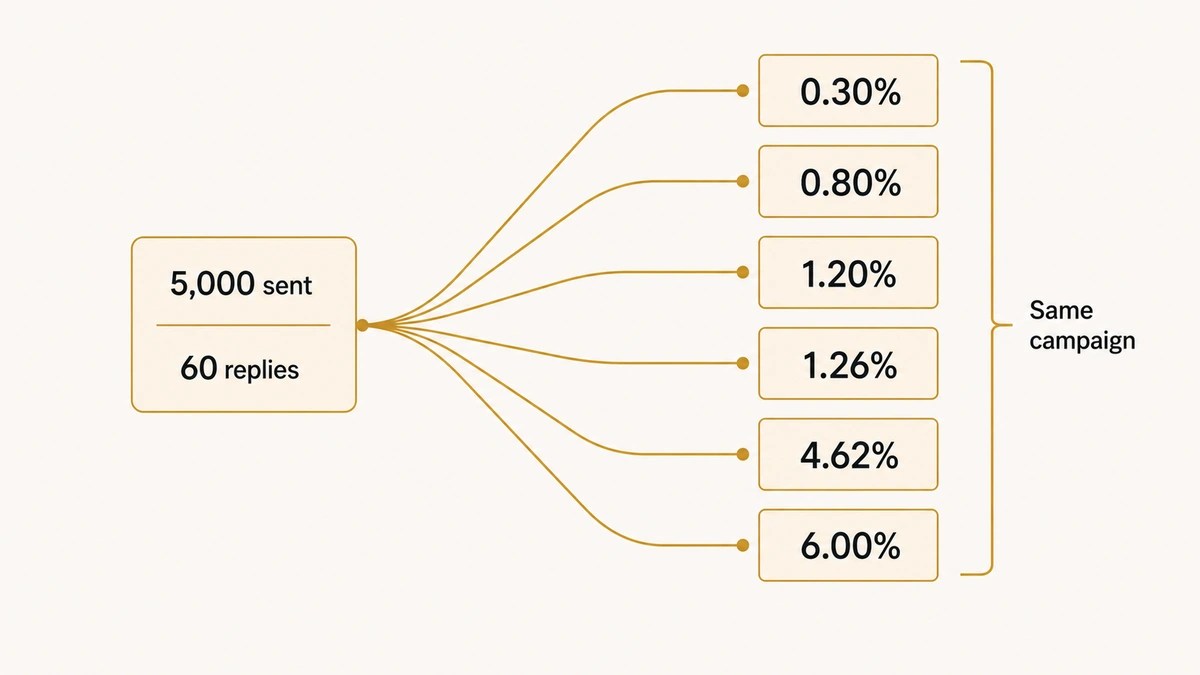
What one campaign looks like under six denominators
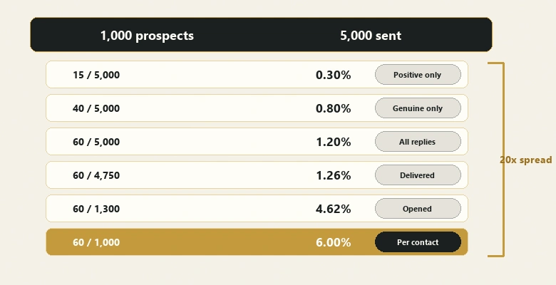
The fastest way to see the problem is to run a single set of results through every formula in circulation. Take one campaign: 1,000 prospects, a five-step sequence, so 5,000 emails sent. A 5% hard bounce rate leaves 4,750 delivered. The platform records 1,300 opens. Sixty replies arrive, of which twelve are out-of-office autoresponders and eight are unsubscribe requests, leaving forty genuine human replies and fifteen that are actually positive.
Every figure below describes that identical campaign.
| Formula | Arithmetic | Reported reply rate | Who reports it this way |
|---|---|---|---|
| Positive replies ÷ emails sent | 15 ÷ 5,000 | 0.30% | Teams tracking pipeline rather than activity |
| Genuine replies ÷ emails sent | 40 ÷ 5,000 | 0.80% | Belkins (auto-replies and bounces stripped) |
| All replies ÷ emails sent | 60 ÷ 5,000 | 1.20% | Instantly, GMass |
| All replies ÷ delivered emails | 60 ÷ 4,750 | 1.26% | Platforms excluding hard bounces |
| All replies ÷ recipients who opened | 60 ÷ 1,300 | 4.62% | Belkins before its 2025 methodology change |
| All replies ÷ contacts | 60 ÷ 1,000 | 6.00% | Sequence tools reporting per prospect |
One campaign, twenty-fold range, and not a single one of those percentages is wrong. The last row is the one that quietly does the most damage in practice, because a five-step sequence credited per contact multiplies the apparent rate by roughly the number of steps. It is also the default in several sequencing tools.
Notice that the spread this arithmetic produces, 0.30% to 6.00%, almost exactly reproduces the 0.45% to 8.5% spread across the nine published benchmarks. That is the argument in one table: the industry disagreement is arithmetic, not performance.
The nine published benchmarks, side by side
Below is every headline cold email reply rate we could find on the live SERP for this query, with what each figure is actually a percentage of. The verdict column records whether the number belongs to the site publishing it.

| Publisher | Figure | Volume | Window | Denominator | Sells sending software? | Provenance verdict |
|---|---|---|---|---|---|---|
| Belkins | 0.45% | 7,530,489 emails | Jan–Dec 2025 | Unique replies ÷ emails sent, excluding auto-replies and bounces | No (outsourced SDR agency) | Own data. Best documented on the SERP. |
| Instantly | 3.43% | “Billions of interactions”, 700k+ businesses | 1 Jan – 18 Dec 2025 | All replies including follow-up responses ÷ total emails sent | Yes | Own data. Methodology stated. |
| Woodpecker | 3.43% | Headline cites 20M+ emails | Not stated | Not stated for this figure | Yes | Not Woodpecker’s number. Linked out to Instantly. |
| Snov.io | 5.1% reply / 27.7% open | 44M+ emails for its own stats | Feb–Mar 2025 | Not defined | Yes | Mixes own data with eight external publishers. |
| Mailforge | 4.1% (range 1–8.5%) | Not stated | Not stated | Not defined | Yes | Bracketed citation markers with no reference list. |
| GMass | 1–5% | “Thousands of campaigns” | Not stated | Replies ÷ emails sent | Yes | Own data, sample size undisclosed. |
| Cleanlist | 3.1% | Not disclosed | “2024–2026” | “Emails that received a response” | Yes (list verification) | Aggregates seven other publishers. |
| Backlinko / Pitchbox | 8.5% | 12,000,000 emails | Last updated April 2019 | Replies ÷ all outreach emails | No | Real study, wrong category. Link-building outreach, not sales. |
| Practitioner posts on LinkedIn | 8.5% | — | — | — | — | Restates the 2019 Backlinko figure as a 2026 sales benchmark. |
Read the volume and window columns together and the pattern is hard to miss. The two figures with a stated collection window and a stated denominator are the two lowest on the table. The highest is seven years old and from a different discipline.
Why the same number appears on two different platforms
The 3.43% figure is the one Google’s AI Overview returns for this query, and it credits Woodpecker. Woodpecker’s page is titled around sending more than 20 million cold emails, which invites you to read 3.43% as the output of that dataset.
It is not. The sentence carrying the number on Woodpecker’s page reads that the average platform-wide reply rate has declined from 5.1% in 2024 to 3.43% in 2026, and the 3.43% is a hyperlink pointing at Instantly’s 2026 benchmark report. Instantly’s report states the figure as its own: “The overall average reply rate is 3.43%”, drawn from billions of interactions across 700,000+ businesses between 1 January and 18 December 2025.
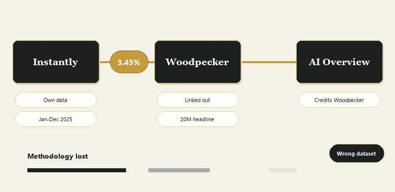
So a reader arrives via an AI Overview that credits Woodpecker, lands on a page headlined with Woodpecker’s 20 million emails, and takes away a number that belongs to a different company’s dataset. Woodpecker did nothing underhanded here. It cited its source correctly with a live link. The attribution decays anyway, because the surrounding page furniture is louder than the hyperlink.
The stated decline compounds it. The 5.1% baseline for 2024 is a figure circulating from Belkins’ earlier reporting, while the 3.43% endpoint is Instantly’s. Two companies, two client bases, two denominators, presented as one platform’s time series. “Cold email reply rates are falling” may well be true. That particular pair of numbers cannot demonstrate it.
The 8.5% benchmark is a 2019 link-building study
The top of the published range has a cleaner origin and a worse fit. It comes from Backlinko’s outreach study, run with Pitchbox as data partner across 12 million emails, which reports that only 8.5% of all outreach emails receive a response.
Two facts about that study rarely travel with the number. It was last updated in April 2019, which makes it seven years old in a field where sender authentication rules, inbox filtering and buyer tolerance have all changed. And it measured content-marketing outreach: guest posting, resource pages, roundups, link requests and mentions. That is a different motion from sales prospecting, with a different reply incentive, because the recipient of a link request often has something to gain by answering.
The 8.5% now circulates on LinkedIn and inside vendor blogs as the average cold sales email reply rate. One widely shared practitioner post states it as the average and concludes that a typical seller sends 100 cold emails to land one meeting. The arithmetic is fine. The input is from a different sport.
IMPORTANT
The same study is the origin of the “one extra follow-up increases replies by 65.8%” claim that appears across cold email content. It is a real finding from real data, and it describes link-building outreach in 2019. Cite it as that, or don’t cite it.
How one agency’s reply rate fell 91% without anything changing
Belkins publishes the lowest number on the table and the clearest explanation for it. Its 2026 study reports a 0.45% average reply rate across 7,530,489 emails sent between January and December 2025.
Compare that with the roughly 5.1% attributed to Belkins in earlier years and you have an apparent 91% collapse. The methodology section says what happened: reply rate is now calculated as replies divided by total emails sent, where in prior years it was calculated against the number of unique recipients who opened an email. Same agency, same client base, same outreach. The formula changed.
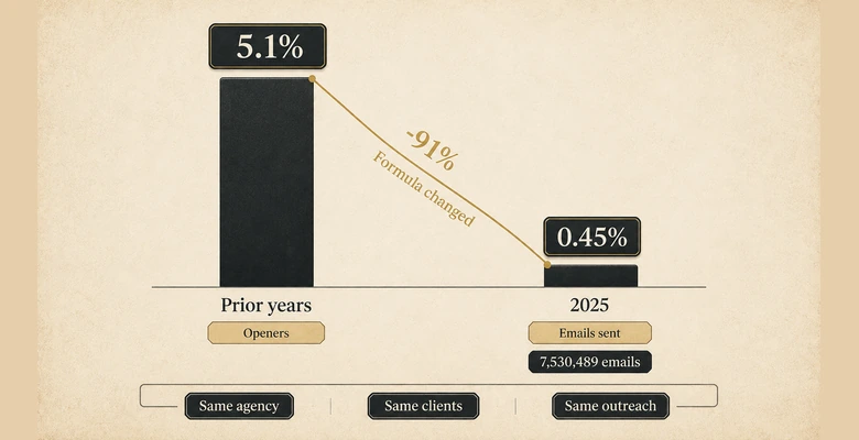
This is the single cleanest demonstration available that the spread across the table is a definitional artefact rather than a performance signal. Anyone quoting the drop as evidence that cold email is dying is quoting a spreadsheet formula.
The segment spread inside a single dataset
Belkins’ internal breakdown is instructive on its own terms, because here the denominator is held constant and only the audience changes.
| Segment | Reply rate | Ratio to the 0.45% dataset average |
|---|---|---|
| Food and beverage | 3.47% | 7.7× the average |
| Banking and insurance | ~0.30% | 0.7× the average |
| Companies with under 10 employees | 0.72% | 1.6× the average |
| Companies with 10,000+ employees | 0.22% | 0.5× the average |
An eleven-fold range by industry and a threefold range by company size both sit inside one consistently measured population. Your segment is somewhere in that distribution, and the published cross-publisher average cannot tell you where. If you sell into banking, a 0.45% target is optimistic by half. If you sell into food and beverage, it is pessimistic by a factor of seven.
This is also why “we beat the industry benchmark” is close to meaningless as an internal claim. A team selling to small food and beverage companies will clear almost any published average without doing anything well, and a team selling to enterprise banking will miss almost all of them while running a competent campaign.
Why open rate can no longer anchor any of these numbers
Open rate is the metric most cold email guides still lead with, and it is the one that has quietly stopped working. Apple Mail Privacy Protection preloads tracking pixels automatically, so a recorded open often means a machine fetched an image rather than a person read a message. Published estimates put Apple Mail at close to half of all recorded opens.
Two responses to that are visible in the data. Woodpecker states plainly that open rate figures vary because MPP inflates reported opens. Belkins went further and disabled open tracking altogether for its study period, on the grounds that the tracking pixel was itself hurting deliverability, and used total sends as the baseline instead.
That second decision is why Belkins’ number had to move. If you stop counting opens, you can no longer divide by them. The publishers still reporting a clean B2B open rate around 27.7% are reporting a number whose denominator includes an unknown share of automated fetches.
It also means the sequencing advice built on open rate is standing on sand. If you cannot trust the open, you cannot trust “they opened three times and didn’t reply” as a signal, and the reply becomes the first honest event in the funnel. Before you tune any of it, confirm your messages are arriving at all: the dig and nslookup checks that verify SPF, DKIM and DMARC catch the failures an ESP control panel reports as green.
The number none of the nine publishers reports
A positive reply rate is the share of sent emails that produce a response advancing the conversation, rather than an opt-out, a rejection or an autoresponder. It is the only reply metric that maps to pipeline, and it is almost entirely absent from the public benchmarks.
Of the nine pages behind this ledger, one distinguishes positive replies from total replies in passing. None publishes a positive reply rate as a benchmark figure. Every headline number on the table counts “take me off this list” as a reply, and several count out-of-office autoresponders as well.
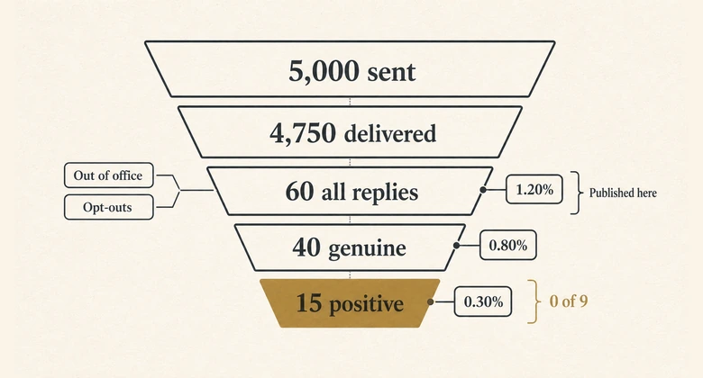
The gap between the two matters more as volume rises. A campaign hitting 4% replies where three quarters of them are opt-outs is destroying list value while reporting a number above most published averages. A campaign at 1.5% where most replies are conversations is building pipeline. On every benchmark in circulation, the first campaign wins.
This is the strongest argument for treating your own instrumentation as the real measurement and the published set as context. Tag replies at intake into three buckets: positive, neutral or referral, and negative or opt-out. Report the positive bucket over emails sent as the headline, and keep total reply rate underneath it as a deliverability signal rather than a performance one.
Doing that also removes the incentive that quietly corrupts cold email programmes. Optimising for total replies rewards provocation, and provocative subject lines reliably produce replies that cost you the account. Optimising for positive replies rewards relevance, which is slower and produces a smaller number you can actually forecast against.
What Google’s AI Overview does with all this
Search this query and the answer most people now read is the AI Overview, not any of the nine pages. On the capture we took on 1 August 2026, it opened by stating that the average platform-wide cold email response rate is 3.43%, with standard campaigns landing between 1% and 5%, good campaigns at 5% to 10%, and top performers above 10%. It credited Woodpecker.
Three things happen in that paragraph. The 3.43% is attributed to the page that links out for it rather than to the company that measured it. The tiers arrive with no denominator attached, so a team whose tool reports replies per contact will read its inflated number against a stricter scale and conclude it is excellent when it is average. And figures from at least three separate datasets are fused into one coherent-sounding picture, with the seams removed.
The omission is the sharpest part. The AI Overview’s stated typical range starts at 1%. Belkins reports 0.45%, and Belkins ranks on page one of the same search. The best-documented study on the results page falls outside the range the summary presents as typical, because its denominator is stricter than the ones the summary was built from.
This is not a complaint about AI Overviews specifically. It is what happens to any number that travels without its methodology attached: each hop drops a qualifier, and the figure arrives at the reader looking more settled than it ever was. The same decay is visible in the vendor blogs citing each other, and it is why this page carries a denominator column rather than a leaderboard.
AI Overviews are generated per session and change over time, so the wording above describes one capture rather than a permanent state. The underlying attribution issue is stable, because it comes from how the source pages are built.
Which number you may quote, and for what
Use this to decide whether a benchmark supports the claim you want to make. Each row states what the figure can carry and what it cannot.
| If you want to say… | Use | Never use it for |
|---|---|---|
| What a strict net-new cold campaign returns | Belkins 0.45%, stated as replies over emails sent across 7.5m emails in 2025 | Warm lists, re-engagement, or any campaign touching existing contacts |
| What a self-serve sending platform sees across its whole user base | Instantly 3.43%, all replies including follow-ups, Jan–Dec 2025 | A single campaign’s target, or your own segment |
| How much follow-up steps add | Woodpecker’s own sequence data: 8.3% for campaigns with three to five follow-up steps against 4.1% with none | A universal cadence rule, or anything outside cold email |
| What link-building outreach returned in 2019 | Backlinko 8.5% across 12m emails | Any 2026 sales prospecting benchmark |
| That reply rates are declining industry-wide | Nothing on this table. No publisher has a consistent multi-year series with a stable denominator | Every use. The 5.1% to 3.43% comparison crosses two companies |
The honest headline, if you need one, is a range with its conditions attached: strict net-new B2B cold outreach measured as replies over sends lands in the low single digits, and campaigns that count follow-up replies or narrow to small verified lists report several times that. Both statements can be true at once.
Sentences you can paste into a deck without being wrong
Most misuse happens at the moment a figure gets compressed into one line for a board slide. These four are pre-qualified, so the denominator survives the compression.
- “Across 7,530,489 emails sent in 2025, Belkins reported a 0.45% reply rate, counting unique replies over emails sent and excluding auto-replies and bounces.”
- “Instantly’s 2026 benchmark report puts its platform-wide average at 3.43%, counting all replies including follow-up responses over total emails sent, for January to December 2025.”
- “Woodpecker’s own sequence data shows campaigns with three to five follow-up steps replying at 8.3%, against 4.1% for sequences with no follow-up.”
- “Backlinko’s 12-million-email study found an 8.5% reply rate for link-building and content outreach, last updated in 2019.”
Each one names the publisher, the population, the denominator and the period. That is the whole discipline. A figure that cannot survive being written out that way is a figure that should not be on the slide.
The reverse test is just as useful. If you are handed a cold email benchmark and cannot answer “percentage of what, measured over which period, by whom, selling what”, the number is not evidence yet. On this SERP, three of the nine publishers fail that test outright.
How to measure your own reply rate defensibly
Your own number is the only one calibrated to your list, your offer and your market. Building it takes four decisions, all of which the published benchmarks made silently on your behalf.
- Fix the denominator and write it down. Replies divided by emails sent is the strictest and the most defensible. Record the choice next to the number, permanently.
- Decide what counts as a reply. Strip auto-replies, bounce notifications and unsubscribes. Then track positive replies separately, because a 4% reply rate made of opt-out requests is not a 4% reply rate.
- Count sends, not contacts. A five-step sequence to one prospect is five sends. Crediting the reply to one contact inflates the rate roughly fivefold and is a common source of the higher published figures.
- Segment before you average. Belkins’ own data spans eleven-fold by industry. Your blended average across segments hides the same range and will not survive contact with a forecast.
Once those four are stable, compare yourself only against your own prior periods. Cross-publisher comparison is the step that introduces the error, and it is optional.
PRO TIP
Before changing copy, check list quality. Woodpecker reports verified lists reply at roughly twice the rate of unverified ones, and both Belkins and Instantly recommend verification ahead of message tuning. The cheapest reply-rate gain is usually subtraction.
What the platform data says actually moves the number
Set the headline averages aside and the same publishers report directional effects that are more useful than any benchmark. These are worth having, with one condition attached to all of them.
| Lever | Reported effect | Source and caveat |
|---|---|---|
| List size | 5.8% at under 50 contacts, roughly 4–5% at 50–200, about 3% at 200–500, falling to 2.1% above 1,000 | Woodpecker. The clearest gradient in the public data |
| Personalization depth | 17–18% with advanced personalization against 7–9% basic or none | Woodpecker. Both figures sit far above the same page’s 3.43% headline, which belongs to a different dataset |
| List verification | Verified lists reply at roughly twice the rate of unverified | Woodpecker. Sells verification |
| Sequence depth | 8.3% for campaigns with three to five follow-up steps against 4.1% with none | Woodpecker’s own sequence data, first-party and internally consistent |
| Overall distribution | Top 10% of accounts reach 10.7%+, top 25% reach 5.5%+, average 3.43% | Instantly. Useful as a distribution, not as a target |
The condition: every one of these comes from a company selling the fix it recommends. That does not make them false, and the list-size gradient in particular is consistent across publishers and plausible on its face. It does mean the effect sizes should be treated as directional rather than as coefficients you can plan against.
Two of them are worth acting on before anything else. Follow-up depth is the first, which is why a sequence where each email earns the next reply outperforms a single well-written send by roughly double. The second is the platform, because per-variant reply tracking and inbox rotation are features rather than defaults, and the tools that run these campaigns are in most cases the same companies publishing the benchmarks you are measuring against. Choosing one is partly a decision about whose definition of “reply” your dashboard will inherit.
Subject lines belong in a narrower box than the guides suggest. They move whether a message is opened, and open is the event that MPP has made unreadable. Treat subject line formulas as an input to reply rate rather than a metric with its own target, and be sceptical of any per-subject-line figure quoted as a response rate in the twenties.
Methodology and what we could not verify
Every figure in the ledger was read on the publisher’s own page during research on 6 August 2026, not taken from a roundup. Where a page linked out for a number, we followed the link and recorded where it landed. Volume, window and denominator columns say “not stated” whenever the publisher did not state them, and no value was estimated to fill a gap.
Three limits are worth stating. The 5.1% figure attributed to Belkins for 2024 is documented on third-party pages rather than on Belkins’ current site, so we treat it as a reported prior value rather than a verified first-party one. Woodpecker’s own 20 million email dataset is real and its sequence figures appear to be first-party, but the page does not date the collection period, so those figures carry no window. And a widely repeated claim that Instantly’s benchmark report contains a 27.7% B2B open rate did not hold: the report as published carries no open rate at all, and the 27.7% figure is published by Snov.io.
The ledger is free to reuse with attribution. Suggested citation: IVRIS Tech, “Cold Email Reply Rate: What the 2026 Benchmarks Actually Measure”, ivristech.com, August 2026.
Frequently Asked Questions
No single average exists. Published 2026 figures run from 0.45% to 8.5% because each counts a different population against a different denominator. Strict net-new cold outreach measured as replies over emails sent lands in the low single digits. Anything higher usually counts follow-up replies, delivered emails, or opens.
It depends entirely on the denominator. Against Instantly’s own tiering, 10.7% or better puts a campaign in the top 10% of its platform. Measured the way Belkins measures, 10% would be more than twenty times its 2025 average. Confirm which formula produced the number before celebrating it.
Open rate is no longer a reliable measure. Apple Mail Privacy Protection preloads tracking pixels, so a large share of recorded opens are automated fetches rather than human reads. One publisher disabled open tracking entirely for its 2025 study. Use reply rate as the first trustworthy event instead.
Because “reply rate” names four different calculations. Replies can be divided by emails sent, delivered emails, contacts, or recipients who opened. Publishers also differ on whether auto-replies count and whether follow-up responses count. Two honest campaigns can report 1% and 6% on identical performance.
From Instantly’s 2026 benchmark report, covering January to December 2025 across its user base, counting all replies including follow-ups over total emails sent. Woodpecker’s statistics page carries the same figure and links out to Instantly for it, so credit for the number often lands on the wrong dataset.