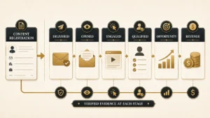

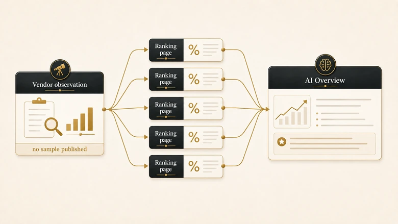
Search CRM data quality benchmarks and the first page agrees with itself almost perfectly. Target 95% accuracy. Keep email validity above 93%. Hold duplicates under 5%. Fill 80% of your critical fields. Stay under a 2% bounce rate. Google’s AI Overview lifts the same set and credits three sources for it. All three sell data products.
Agreement that tight usually means one of two things. Either the field has settled on a measured standard, or everyone is quoting the same handful of pages. IVRIS checked which. We took each number that appears on the ranking pages, traced it back to the document that first published it, and recorded what that document actually measured, on what sample, in what year. Four numbers in this category survive that check. The five most quoted ones do not.
This page is about measurement only. Remediation lives elsewhere in the cluster, starting with CRM data cleansing services for scope, pricing and vendor selection.
Direct answer — What are the real CRM data quality benchmarks?
Most published CRM data quality benchmarks are vendor observations rather than measured standards. The widely quoted set of 95% accuracy, 93% email validity, under 5% duplicates, 80% field completion and under 2% bounce traces to data vendors describing their own customer base, with no sample size, match rule or field register published. Four figures in the category survive a provenance check. Measure your own baseline on your own definitions instead of adopting a published target.
Key Takeaways
- The 93% email validity, sub-5% duplicate, 80% field completion and sub-2% bounce cluster all come from one vendor page, which describes them as patterns observed across its own customer cleanups. No sample size is given.
- A duplicate rate is a property of your match rule, not of your database. Two teams can measure the same records and report 2% and 19% without either being wrong.
- Field completion has the same problem. Eighty percent of which fields? Change the required-field register and the same data scores anywhere from single digits to 100%.
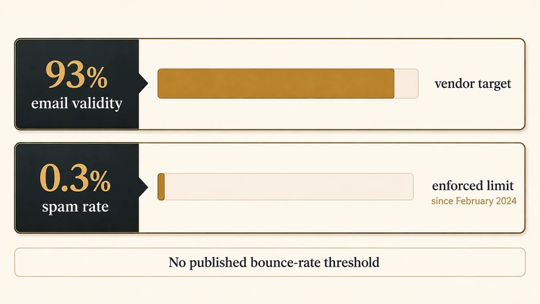
- The only enforced threshold in this space is Google’s bulk sender spam rate limit of 0.3%, live since February 2024. It appears on nobody’s CRM benchmark list, and Google publishes no bounce-rate threshold at all.
- The strongest independent measurement is still the 2017 Harvard Business Review study behind the “3% of data meets basic quality standards” figure, because it published its method and anyone can rerun it in an afternoon.
- Score each dimension separately and let the weakest one set the verdict. A single averaged health score hides the one failure that is actually breaking your pipeline.
The five numbers in circulation, and who published them
CRM data quality benchmarks are published targets for how accurate, complete, unique and current the records in a CRM should be. The table below takes each figure that the ranking pages present as a benchmark and records where it actually came from.
| Figure as quoted | Original publisher | Sample and method published | Publisher sells remediation | Provenance verdict |
|---|---|---|---|---|
| 95% accuracy or higher | Databar, January 2026 | No. Presented as article guidance with no external citation | Yes, data enrichment | Vendor assertion |
| 93% to 97% email validity | Cleanlist, February 2026 | No. Labelled as observed across the vendor’s own customer cleanups | Yes, data cleaning | Vendor observation |
| Duplicate rate under 5% | Cleanlist, February 2026 | No, and no match rule is stated | Yes, data cleaning | Vendor observation, undefined metric |
| Field completion above 80% | Cleanlist, February 2026 | No, and no required-field register is stated | Yes, data cleaning | Vendor observation, undefined metric |
| Bounce rate under 2% | Cleanlist and Databar, 2026 | No. No mailbox provider publishes this threshold | Yes, both | Industry convention, not a standard |
| Health score bands of 80-100, 60-79, under 60 | Databar, 2026 | No. Band boundaries are not derived from any stated distribution | Yes, data enrichment | Vendor assertion |
Each ranking page was retrieved and read in full on 9 August 2026, working from the United States English desktop result for “crm data quality benchmarks”. Where a page named an upstream source, we followed the citation to the earliest retrievable document. “Vendor observation” means the publisher describes real data it has seen without publishing the sample, definition or period that would let anyone check it.
One figure that belongs in this conversation is deliberately absent from the table. The 2.1% monthly decay rate, and the 22.5% and 25% to 30% annual figures derived from it, have already been traced to origin. That work sits in our CRM data decay statistics reconciliation, which follows the chain back to a 2012 MarketingSherpa benchmark report whose published sample and method are no longer retrievable. Decay is a rate of change over time, not a quality threshold, so it does not belong in a scorecard alongside completeness and validity.
A standard, a survey finding and a vendor observation are three different things
A benchmark is a reference point somebody measured and published with enough detail to be checked. Very little of what circulates as a CRM data quality benchmark meets that description, and the failures are not all the same kind of failure.
Three tiers are worth separating, because each supports a different weight of argument.
- Published standards. A named body defines the measurement and, occasionally, a threshold. DAMA’s dimension work and ISO/IEC 25012 define what to measure. Google’s bulk sender rules define an enforced limit. These are checkable and dated.
- Surveys with disclosed method. A publisher states the sample, the population and the period. Validity’s 2025 CRM report gives 602 respondents. Experian’s 2021 benchmark gives 700. Salesforce’s data and analytics research runs past 10,000 leaders across 18 countries. Commercial interest does not disqualify these, because the disclosure lets you discount for it.
- Vendor observations. A publisher reports what it sees across its customer base and attaches a target to it. No sample, no period, no definition. This is where the 93%, sub-5% and 80% figures all sit.
The test that separates the tiers is short. Can you name the sample, the year and the definition? If any of the three is missing, the number is a starting opinion, and treating it as a target means importing a stranger’s assumptions about your data model.
Worth being fair about the middle tier. Vendor-funded research that publishes its n is genuinely useful, and dismissing it because a vendor paid for it is lazy. The distinction that matters is disclosure, not who wrote the cheque.
Email validity: 93% is a vendor floor, and under 2% bounce is not a standard
Email validity is the share of stored addresses that a verification service judges deliverable. The circulating target of 93% and above, with 97% and above rated excellent, comes from a single data-cleaning vendor’s description of its own customer base.
There is a real, enforced number in email, and it is not on anybody’s CRM benchmark list. Since 1 February 2024, Google’s bulk sender requirements have obliged senders of more than 5,000 messages a day to Gmail accounts to keep the spam rate reported in Postmaster Tools below 0.3%, with a recommendation to stay below 0.10% and never reach 0.30%. That is a threshold with consequences attached: cross it and delivery degrades.
Read those requirements looking for a bounce-rate limit and you will not find one. Google says nothing about bounces. The sub-2% figure is an email service provider convention, sensible enough as a working ceiling, but it has no standards body behind it and no measured distribution underneath it.
IMPORTANT
Your bounce target should come from your sending platform’s suppression policy and your own Postmaster spam rate, not from a CRM benchmark page. The number that actually governs your deliverability is 0.3%, and it measures complaints rather than bounces.
There is a second problem with adopting a validity percentage as a target. Verification services disagree with each other on the same list, particularly on catch-all domains where no provider can confirm a specific mailbox exists. A list that scores 94% valid with one service can score 88% with another because one counts catch-alls as risky and the other counts them as valid. Without naming the verification service and its catch-all treatment, a validity benchmark is not reproducible.
Duplicate rate: under 5% of what, matched how?
A duplicate rate is the share of records in a database that refer to an entity already represented by another record. The published bands run from under 3% rated excellent, through 3% to 5% rated good, to above 20% rated critical.
None of those bands states a match rule, which makes them unusable as written. A duplicate rate is not a property of a database. It is a property of a database plus the rule you used to decide what counts as the same person or company.
Duplicate rate = Duplicate records ÷ Total records, under a stated match ruleThe rule does most of the work. Match on exact email address and a contact who registered twice with a work address and a personal one is two clean records. Match on normalised first name, last name and company domain and the same pair collapses into one duplicate. Add fuzzy company-name matching so that “IVRIS Tech”, “Ivris Technologies” and “ivristech” resolve together, and account-level duplicates surface that exact matching never saw.
Run all three rules against one CRM and you will get three different duplicate rates from the same records, potentially spanning single digits to the high teens. Every one of them is accurate. Only one of them is comparable to whatever the vendor measured, and the vendor did not say which rule it used.
This is why the useful version of the metric is internal. Pick a match rule, write it down, measure against it, and track the trend. The rule matters more than the rate, and the mechanics of choosing one are covered in our guide to lead deduplication. If you are evaluating tooling to enforce it, Salesforce deduplication software grades what each product actually discloses about its matching.
Field completion: 80% of which fields?
Field completion measures the share of records that have a value in the fields you consider required. The circulating target is above 80% for mandatory and go-to-market critical fields, with a competing page putting well-governed teams at 75% to 85% on contacts and treating anything below 60% as a warning sign.
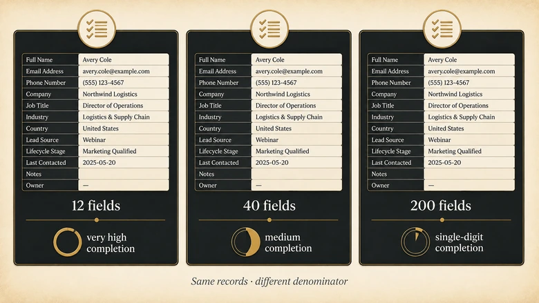
Neither publishes the field list, and without it the number carries no information. A mid-market Salesforce org routinely carries two hundred or more fields on the contact object. Declare twelve of them required and a database can report 94% completion. Declare forty and the same records report 51%. Declare all two hundred and it reports single digits. Nothing about the data changed.
The measurement only becomes meaningful against a published required-field register: the specific list of fields that a downstream process will break without. That register is unavoidably local, because it is determined by your routing rules, your segmentation, your scoring model and your territory logic. Somebody else’s 80% tells you nothing about whether your routing will fire.
PRO TIP
Build the required-field register backwards from the processes that consume the data. For each automated rule you run, list the fields it reads. The union of those lists is your register, and it is usually far shorter than the field list somebody proposed in a governance meeting.
Completeness in the formal sense, as DAMA’s dimension work defines it, is the proportion of stored data against the potential of “100% complete”. The standard is explicit that the denominator is a local decision. The vendor targets quietly drop that qualification, which is what turns a definition into a benchmark it was never meant to be.
The four numbers that survive an audit
Four reference points in this category hold up when you follow them to source. None of them is a target percentage for your CRM, which is itself the finding.
The 3% figure, and the method behind it. In 2017, Tadhg Nagle, Thomas Redman and David Sammon published Only 3% of Companies’ Data Meets Basic Quality Standards in Harvard Business Review. On average 47% of newly created records carried at least one critical error, and only 3% of the data quality scores they collected rated acceptable under the loosest standard they applied. What makes this the strongest number in the field is not the finding. It is that the method was published. The Friday Afternoon Measurement takes the last 100 records your team created, checks 10 to 15 critical attributes on each, marks any record with an error, and scores clean records out of 100. Redman and colleagues went on to build a database of 195 such measurements. Anyone can rerun it, which is the property every vendor benchmark lacks.
Google’s 0.3% spam rate. Dated, enforced, published by the party that enforces it, and applicable to every B2B team sending at volume.
The dimension frameworks. DAMA’s working group settled on six dimensions in 2013: completeness, uniqueness, timeliness, validity, accuracy and consistency. ISO/IEC 25012, published in 2008, defines fifteen characteristics split across inherent and system-dependent views. Both define what to measure. Neither sets a threshold, and that restraint is deliberate.
Surveys that name their sample. Validity’s State of CRM Data Management in 2025 reports 602 CRM users and stakeholders, of whom 76% said less than half their organisation’s CRM data is accurate and complete and 37% reported losing revenue as a direct result of poor data quality. That is a usable finding about how bad things are. It is not a target.
Two widely repeated cost figures deserve a note. Gartner’s estimate that poor data quality costs organisations an average of 12.9 million dollars a year is real, dates from 2020, and is scoped to all enterprise data rather than CRM specifically. It is routinely quoted as a CRM number. The 3.1 trillion dollar figure attributed to IBM has no retrievable original and should not be used.
The most rigorous number in CRM data quality is not a benchmark. It is a method you can run on a Friday afternoon.
Why vendor-published benchmarks skew, and in which direction
Vendor observations are not fabricated. The pattern the vendor describes is usually a real pattern in real data. Four structural effects still make them unsuitable as targets, and all four push the same way.
Selection bias. A data-cleaning vendor’s sample is composed of organisations that already suspected they had a data problem and bought help. That population is not the population of CRMs. Whatever baseline it produces will be worse than the general case, which makes the vendor’s recommended target look further away than it is.
Definitional freedom. The publisher chooses the match rule, the required-field register and the verification service. Each choice moves the resulting percentage, and none is disclosed. The metric is unfalsifiable in the plain sense: there is no observation that could contradict it.
Survivorship. Only records that reached the vendor’s system get measured. Records the client never exported, in the objects nobody thought to include, are absent from the sample and are frequently the worst ones.
Commercial direction. When a measurement choice is genuinely ambiguous, the resolution that supports the product is the one that gets shipped. Nobody has to act in bad faith for this to happen consistently.
A fifth effect is newer, and it is the reason this matters more in 2026 than it did three years ago. Google’s AI Overview for this query synthesises the same vendor pages into a single block of prose with the hedging removed. Cleanlist’s “patterns we observe across customer cleanups” arrives as “good CRM data quality targets 95%+ accuracy, over 80% field completion, under 5% duplicate records”. Databar’s unexplained health-score bands arrive as tiers. The qualifications that made the original honest are exactly what gets stripped in summarisation, because they read as noise to a summariser.
The consequence is a citation loop. A reader takes the number from the AI Overview, publishes it, and the new page becomes another apparently independent corroboration of a figure that still has one source. Five pages agreeing is not five measurements. On this SERP it is closer to two, and neither published a sample.
Our own view, stated plainly: the useful contribution these vendors make is the dimension list, not the thresholds. Cleanlist and Databar both organise the problem sensibly. Adopt their structure and throw away their numbers.
Measure your own baseline instead of adopting a published target
The alternative is not complicated and does not need a tool. Adapting the Friday Afternoon Measurement to a CRM gives you a defensible baseline in about ninety minutes, using records you already have and definitions you control.
Workflow · 90 min
How to measure your own CRM data quality baseline
Produces a per-dimension score for your CRM from a 100-record sample, using definitions you publish rather than thresholds borrowed from a vendor page.
Write the required-field register first
List every automated rule that reads contact or account data: routing, scoring, segmentation, territory assignment, lifecycle transitions. Record which fields each one reads. The union of those fields is your register, and nothing outside it counts against completeness.
State your match rule in writing
Decide what makes two records the same entity. Write the rule down at the field level, including how you treat personal versus work email and how company names are normalised. Every duplicate figure you publish afterwards is read against this rule.
Pull the last 100 records created
Export the 100 most recently created contacts, not a random sample across all time. Recent records measure the process that is running now, which is the thing you can actually change.
Score each dimension on the same 100 records
Work down the six dimensions in the scorecard below. For each one, count how many of the 100 records pass, and record the count. Use one sample for all six so the scores are comparable to each other.
Take the lowest dimension as the verdict
Do not average the six. Record the weakest score as the baseline and name the dimension alongside it, because that dimension is what is breaking downstream processes right now.
Rerun it monthly on the same definitions
Repeat with a fresh 100 records each month without changing the register or the match rule. The trend across months is the number worth reporting; the absolute score matters far less than its direction.
Ninety minutes is the honest estimate for a first run, most of it spent on steps one and two. Later runs take under half an hour because the definitions already exist.
The CRM data quality scorecard
The scorecard scores six dimensions independently on one sample of 100 records. It produces six numbers and one verdict, and the verdict is the lowest of the six.
| Dimension | What you count on the sample | Your definition to fix first | What a weak score breaks |
|---|---|---|---|
| Completeness | Records with every required-register field populated | The required-field register | Routing, scoring and segmentation fail silently |
| Uniqueness | Records with no other record matching them | The match rule | Split engagement history, double outreach, inflated counts |
| Validity | Records where every field conforms to its format or picklist | Format rules and picklist sets | Integrations reject records, reports drop rows |
| Accuracy | Records that match reality on a manual spot check | The check source and how many fields you verify | Forecasts and territory plans built on fiction |
| Consistency | Records represented identically across connected systems | Which system is authoritative per field | Attribution gaps, handoff failures between tools |
| Timeliness | Records verified or updated inside your own interval | The re-verification interval | Outreach to people who left, dead numbers, bounces |
Dimensions follow DAMA’s six-dimension framing. Score each as passing records out of the same 100-record sample, on definitions you publish. Percentages here are yours to generate; this page deliberately publishes no target values, because a target imported from another organisation’s data model is not a benchmark.
Averaging the six into a single health score is the standard move, and it is the wrong one. A composite converts independent failures into one number, which lets a column of strong scores absorb the single dimension that is actually breaking things. A database at 96% completeness, 97% validity, 95% consistency and 41% uniqueness averages to a respectable-looking figure while duplicate records quietly split every account’s engagement history. Report the 41%.
IMPORTANT
Do not compare your scores to anyone else’s. They are computed on your register, your match rule and your verification source, which means they are only comparable to your own previous runs. That is a feature. A number you can defend beats a number you can benchmark.
Two dimensions need a caveat. Accuracy is the only one requiring manual verification, so it is the most expensive to score and the most often skipped; sample twenty records rather than a hundred if that is what makes it happen. Timeliness depends on an interval you set from your own bounce data rather than a published cadence, and the arithmetic for deriving it sits in the decay reconciliation linked earlier.
What each dimension score should actually change
A baseline is only worth producing if it changes a decision. Each weak dimension points at a different repair, and the repairs have an order.
| Weakest dimension | Fix this first | Do not start with |
|---|---|---|
| Validity | Entry-point rules: picklists, format validation, required fields on forms | A cleaning project, which will refill with the same malformed values |
| Uniqueness | Prevention at creation, then a merge policy with survivorship rules | A bulk merge, which destroys history without stopping the inflow |
| Completeness | Shortening the required register, then enrichment for what remains | Making more fields mandatory, which produces junk values |
| Consistency | Declaring one authoritative system per field | Two-way sync, which propagates the disagreement faster |
| Timeliness | A re-verification interval derived from your own bounce curve | A blanket annual refresh, which over-treats stable segments |
| Accuracy | Finding the entry path producing the errors | Buying a data provider before you know where errors originate |
The ordering rule underneath the table: fix the inflow before you fix the stock. Validity and uniqueness are both entry-point problems, and remediating either without closing the entry point buys a few months. Completeness and timeliness are stock problems, genuinely improvable by enrichment or re-verification, and worth spending on once the inflow is controlled. Tools for that second stage are graded in our review of data enrichment tools, where the same disclosure test applied here is used on vendor coverage claims.
One honest limitation. This scorecard measures the state of records. It does not measure whether you are collecting the right fields in the first place, which is a strategy question rather than a quality one, and a CRM can score well on all six dimensions while holding data nobody needs.
Methodology, sources and revision history
How this was compiled. IVRIS captured the United States English desktop result for “crm data quality benchmarks” on 9 August 2026 and read each ranking page in full on the same date, including Cleanlist’s benchmarks page and Databar’s CRM data quality guide. Where a page named an upstream source, we followed the citation to the earliest retrievable document and recorded what that document itself claimed rather than what the citing page said it claimed.
What we did not do. IVRIS did not run a data quality study, did not commission one, and holds no proprietary CRM quality data. Every provenance verdict describes what can be verified from public documents today. The scorecard is a method, not a dataset, and it deliberately ships without target values.
Access limitations, stated plainly. Three primary sources in this area resist checking. Gartner’s data quality pages return an automated-access block, so the 2020 cost estimate was confirmed against Gartner’s own published summaries rather than a retrieved page. ISO/IEC 25012 is a paid standard behind a block of the same kind. The DAMA UK six-dimensions white paper is members-only on the DAMA UK site; the framework is described publicly in DAMA Netherlands’ Dimensions of Data Quality research paper, which is freely downloadable. That the field’s most-cited framework is easier to read in a vendor’s copy than at its source is part of why unsourced restatements travel so well.
One limitation worth naming. Absence of a published sample does not prove a vendor invented a figure. Cleanlist and Databar are almost certainly describing real patterns in real customer data. What is missing is the disclosure that would let anyone check the pattern or reproduce the measurement, and that absence is what disqualifies the figures as benchmarks, not any suspicion of bad faith.
This page will be re-audited when any ranking page publishes a sample and method for its figures, and at minimum every six months.
DOWNLOAD THE SCORECARD
Score your own database on all six dimensions with the IVRIS CRM Data Quality Scorecard v1.0 (XLSX), or use the matching 100-record tally template (CSV). Includes the required-field register worksheet, the match-rule declaration, a tally sheet per dimension and a worst-governs verdict cell. Free, no email required.
Suggested citation: IVRIS Tech. “CRM Data Quality Benchmarks: Provenance Audit and Scorecard.” ivristech.com, 2026. https://ivristech.com/crm-data-quality-benchmarks/
Frequently Asked Questions
CRM data quality is how well the records in a CRM represent reality for the processes that read them. It is measured across dimensions rather than as one figure: completeness, uniqueness, validity, accuracy, consistency and timeliness. A record can be perfectly formatted and still wrong, so validity and accuracy are separate things.
The five C’s are usually given as clean, consistent, conformed, current and comprehensive. It is a mnemonic rather than a standard, with no traceable originating body, and it overlaps heavily with DAMA’s six dimensions. Useful for explaining the idea to stakeholders, not for defining a measurement.
Different publishers name different fours, most often accuracy, completeness, consistency and timeliness. The disagreement between four pillars, five C’s, six dimensions and seven measures exists because none of the shorter framings is a standard. The two formal frameworks are DAMA’s six dimensions and ISO/IEC 25012’s fifteen characteristics.
Seven-item lists typically take DAMA’s six dimensions and add one of integrity, relevance or currency. There is no authoritative seven. If you need a defensible list, use DAMA’s six and state your own definition for each, because the definition matters far more than how many items are on the list.
There is no published score worth adopting, because every circulating target depends on a match rule and required-field register the publisher did not disclose. Score six dimensions on your own definitions, take the weakest as your verdict, and judge progress against your own previous run rather than a vendor’s band.